Ante Mortem
Introduction
Ante Mortem is a mobile app conceived to help people organize and execute items on their “bucket list” - the things they would like to accomplish before dying.
Tasks
Identify user motivations for accomplishing a bucket list item.
Identify the pain points that keep users from acting on their goals.
Test methods to keep users on track for accomplishing goals.
Build, test, and iterate interactive components.
Tools
Figma, Figjam, Illustrator, Photoshop, Miro
Timeline
80 Hours
Role
Sole Product Designer
(Concept, Research, Branding, Prototype, UI)
Why Bucket Lists?
In 2008 I completed a significant bucklet list of my own: Writing an original novel.
However, after that success it was easy to fall back into old habits and put off other goals for "tomorrow".
My mother passed away when she was just 55-years old and I often wonder how many things she had been planning to do "tomorrow".
Research Plan
Feasability Study: Is this a problem that needs solving?
Competitve Analysis: What other products are in this space? What are their strengths and weaknesses?
User Interviews: What are the experiences of potential users? What are they pain points and successes?
Feasibility Survey: Notable Results
22 people responded to a feasablity survey and these were some of the most noteworthy findings.
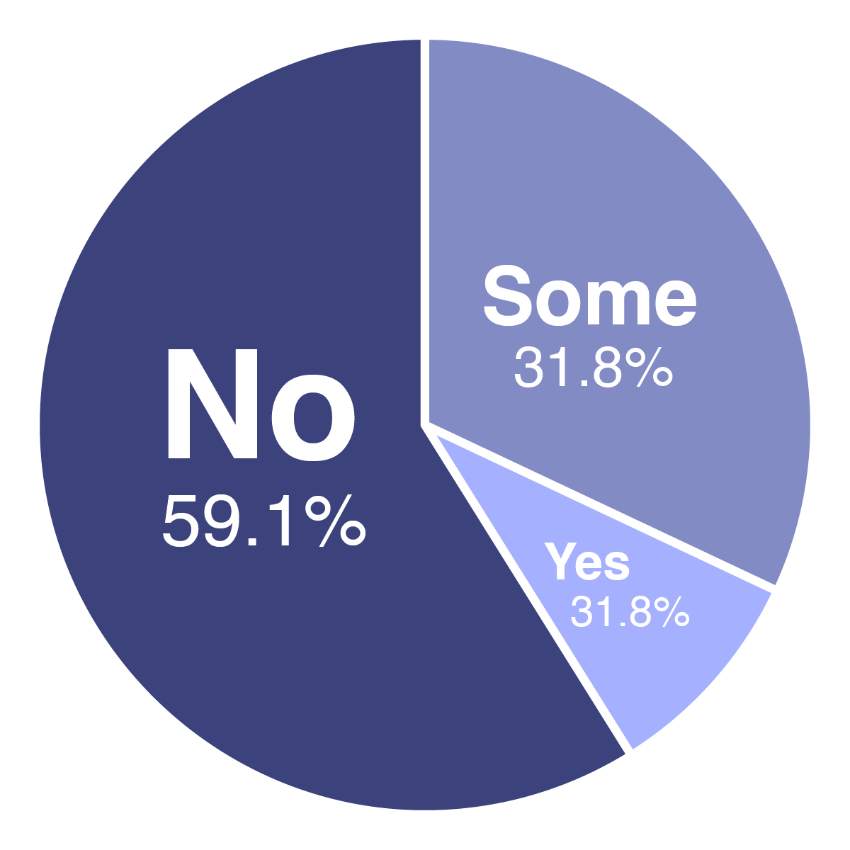
59%
of respondents had not written down ANY of their goals
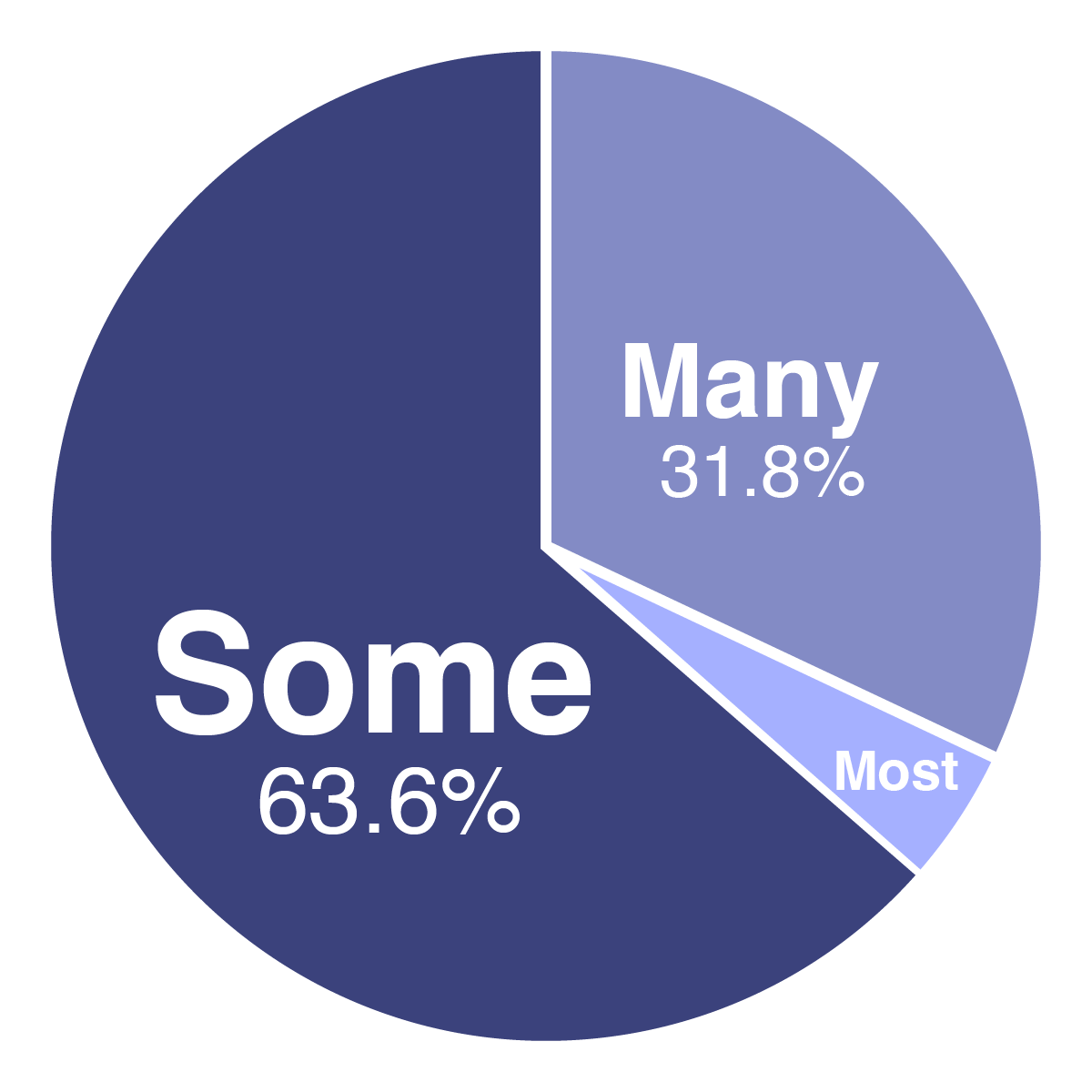
100%
of respondents said that some, many, or most of their goals required a large financial commitment

Only 4.6%
felt it would be helpful to share their goal with friends and family
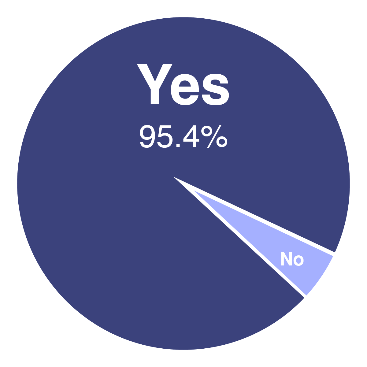
95%
had at least one goal they considered private

95%
had at least one goal that required small consistent efforts, like learning a language or preparing for a marathon.
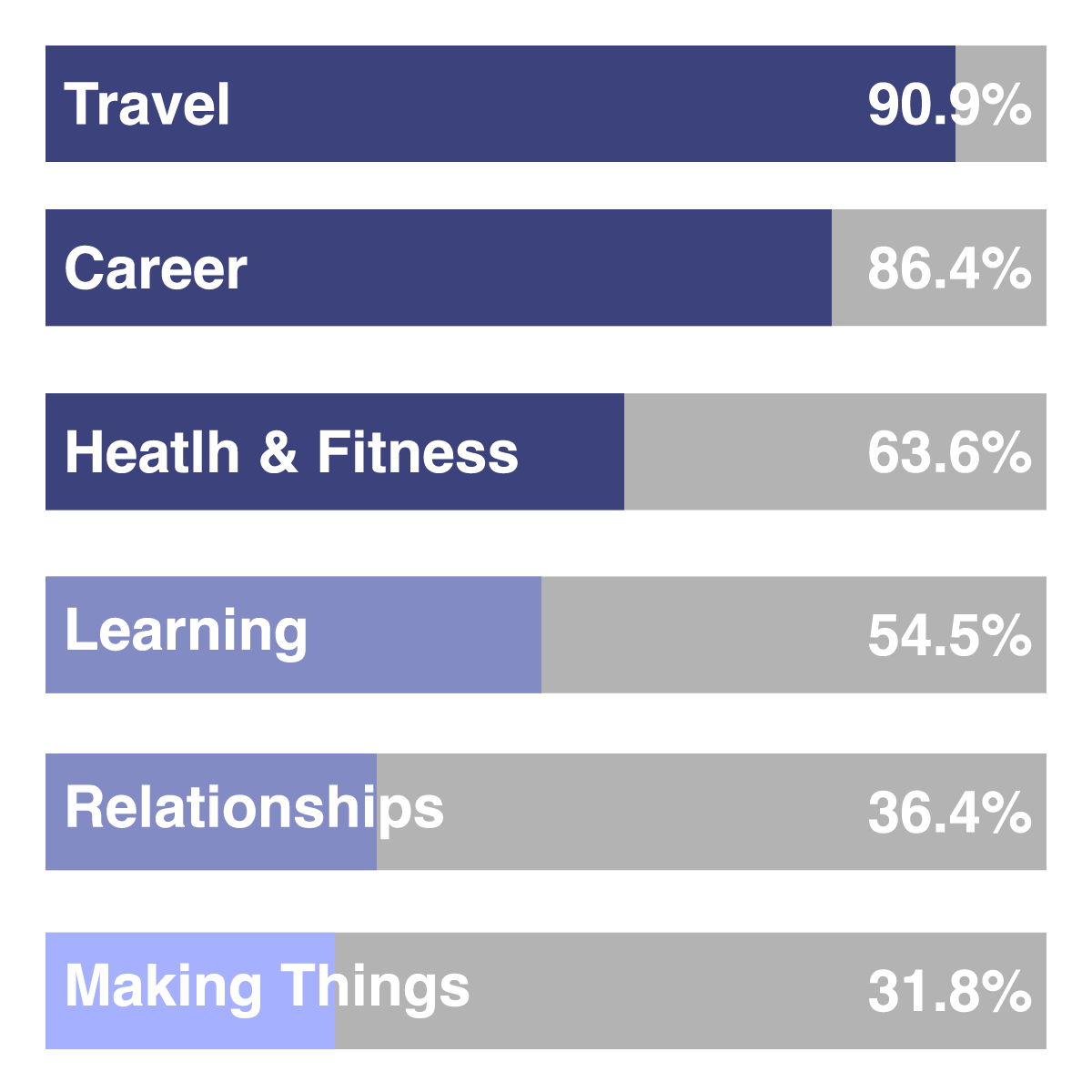
91%
listed travel as a type of goal on their list, however...
User interviews showed that it was rarely the highest priority goal for most individuals.
Survey and Interview Takeaways
Bucket lists goals are highly individualistic
Users were interested in following other users with similar goals
Users reported that they were more likely to start work on a goal if it suddenly seemed more within reach (eg. If learning to fence was on their list, and they learned their neighbor was a fencing instructor)
Saving money is an important aspect of accomplishing many goals.
Competitive Analysis
There were plenty of simple list making apps and some purported to focus on bucket list items, but few had much of a user base (based on download counts). Focused on the use of three most popular apps: iBucket, My Bucket List, and Buckist
iBucket
Strengths: Not reliant on ad-based revenue. Premium option is a one-time cost and not a subscription model. It offers some articles for destination suggestions and some in-app travel purchases.
Weaknesses: Largely based on travel goals and not bucket list items in general. Does not offer any ability to track or set savings aside.
My Bucket List
Strengths: Allows users to manual keep track of savings.
Weaknesses: Lots of ads; Will sometimes force the user to watch a 30-second ad. Limited categories. Very basic features often require an upgrade to premium via a subscription model.
Buckist
Strengths: Allows the creation of sub-tasks, custom categories, and following other users.
Weaknesses: Some irrelevant advertisments. No method to track or set aside savings. No in-app purchases.
Feature Roadmap
A roadmap of features was sorted by priority (1 = Necessary, 3 = Nice to have). This helped to define the narrow scope to the minimum viable product.
Narrow Scope to MVP
Other Requirements
The most prominent features required for the minimum viable product included:
• Make periodic notes on a goal
• Set privacy settings on individual items, not just the profile as a whole
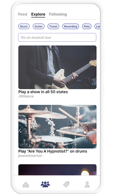
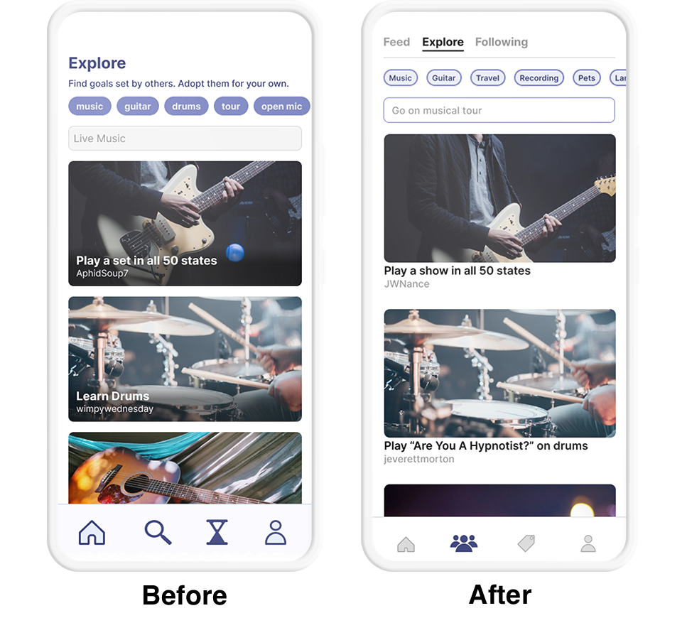
• Find and follow similar goals for inspiration
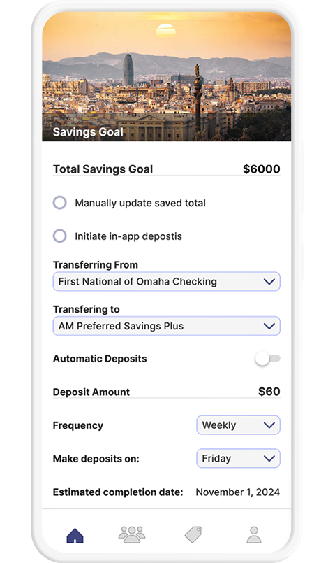
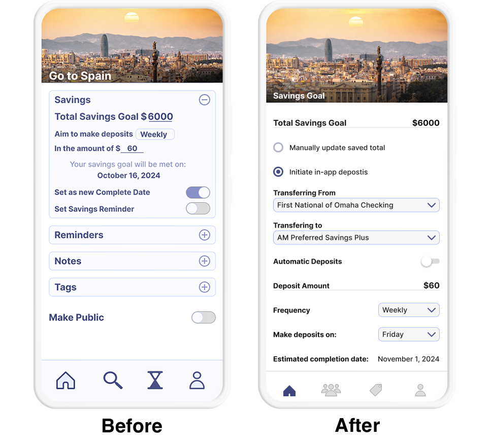
• Transfer funds to an account for to save towards goals
• Explore discounted experiences for sale
For a premium user experience, there were some of the additional requirements:
• No limit on goals, reminders, or photos
• Free of unrelated advertisements
• No need to unlock a premium version through a purchase or subscription
Opportunities for Monetization
Is there a way to offer the user a premium experience
without directly billing them for a download or subscription?
Partnership with FInancial Institutions
Affilliate Resale Partners
One of the core combination of features is reminding users to consistently save towards a goal and allowing them to make transfers to a savings account.
This would allow an affilliate financial institution to offer perks for opening a new account as well as offering higher interest rates for long-term savers. For users willing to sacrifice the ability to withdraw a deposit within 3-12 months, a product such a fractional CD might allow a bank to profit on a percentage of the deposit while offering the user an interest rate greater than would be found in a regular savings account.
The win-win for the user and the financial instution in this scenario is great enough that it would make sense for a financial institution to be the developer and marketer of such an app.
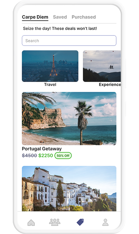
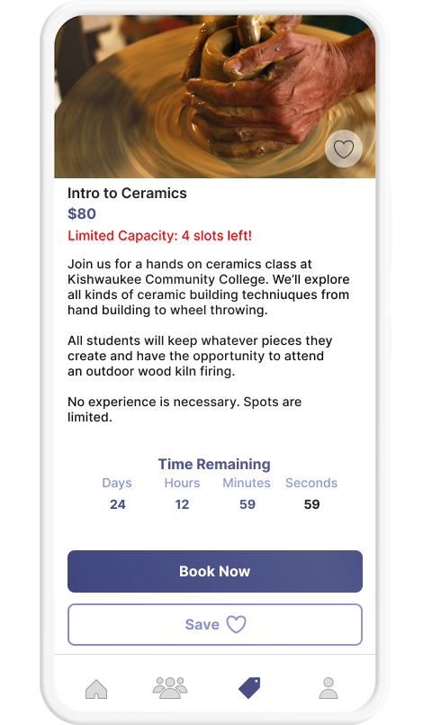
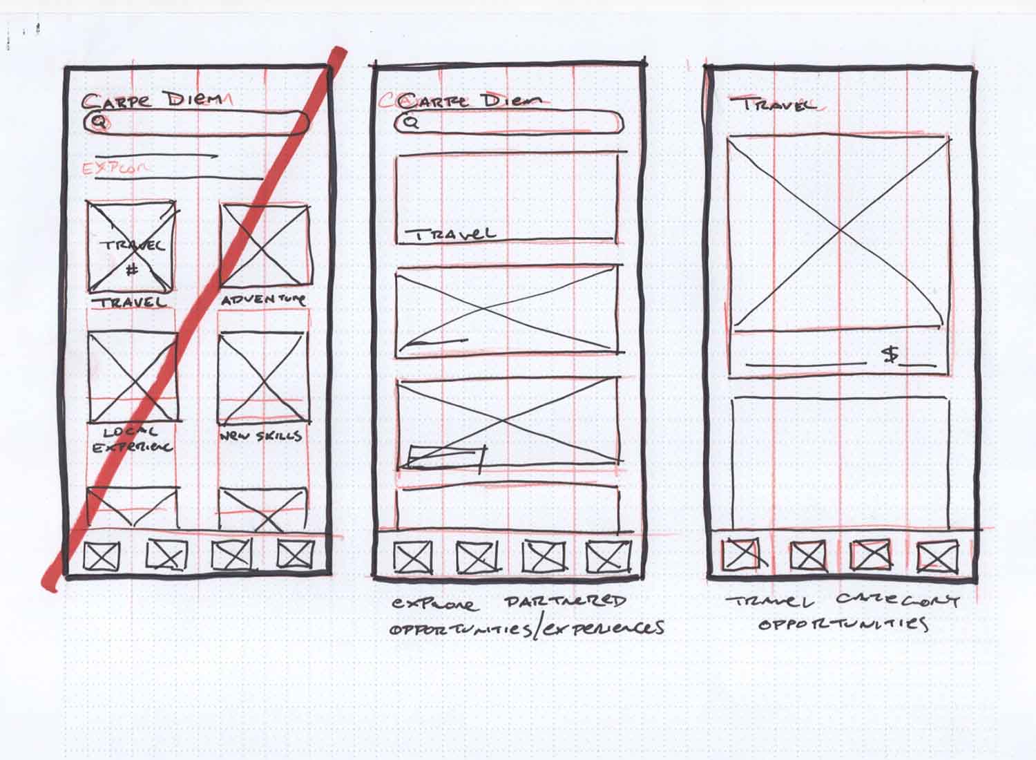
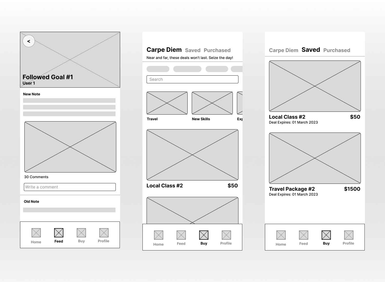
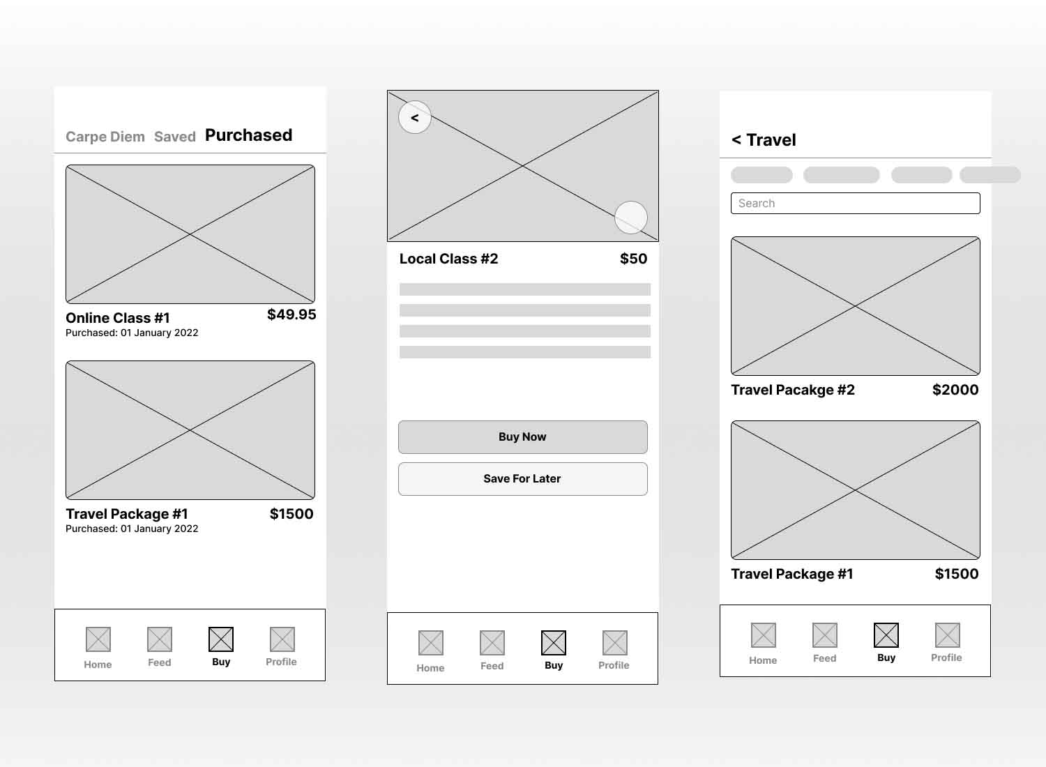
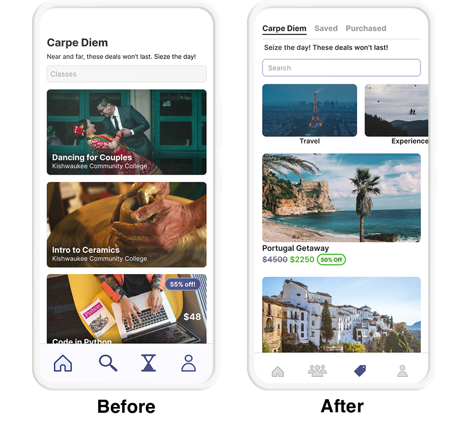
The Carpe Diem section of the app offers discounted prices on travel, experiences, and learning opportunities. This is in response to user research that showed users are more likely to take action on a goal if it seems the goal is closer to attaining than once believed.
Similar to Groupon, this would target users with affiliate purchase opportunities as a potential for monetizing the app.
Information Architecture
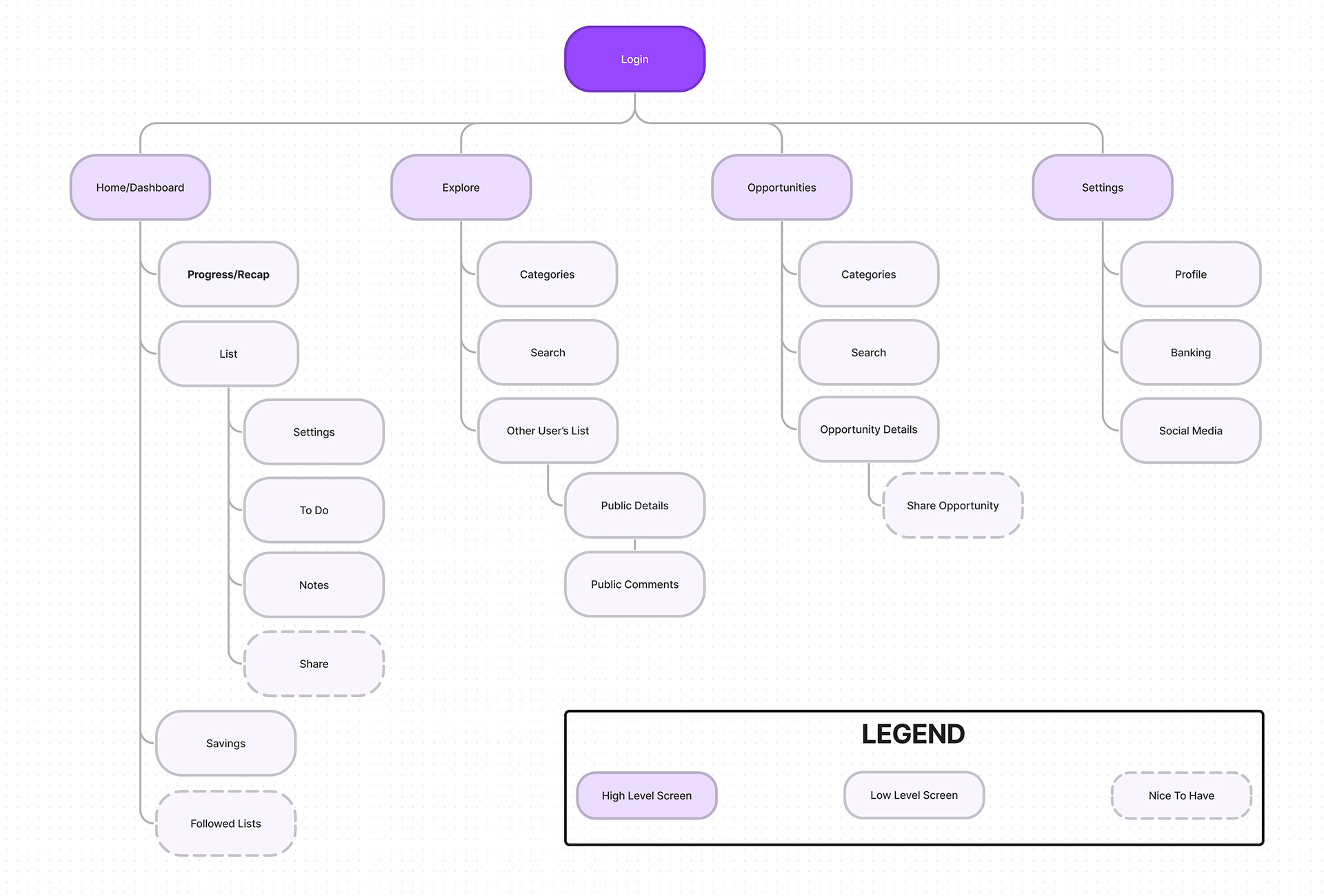
App Map
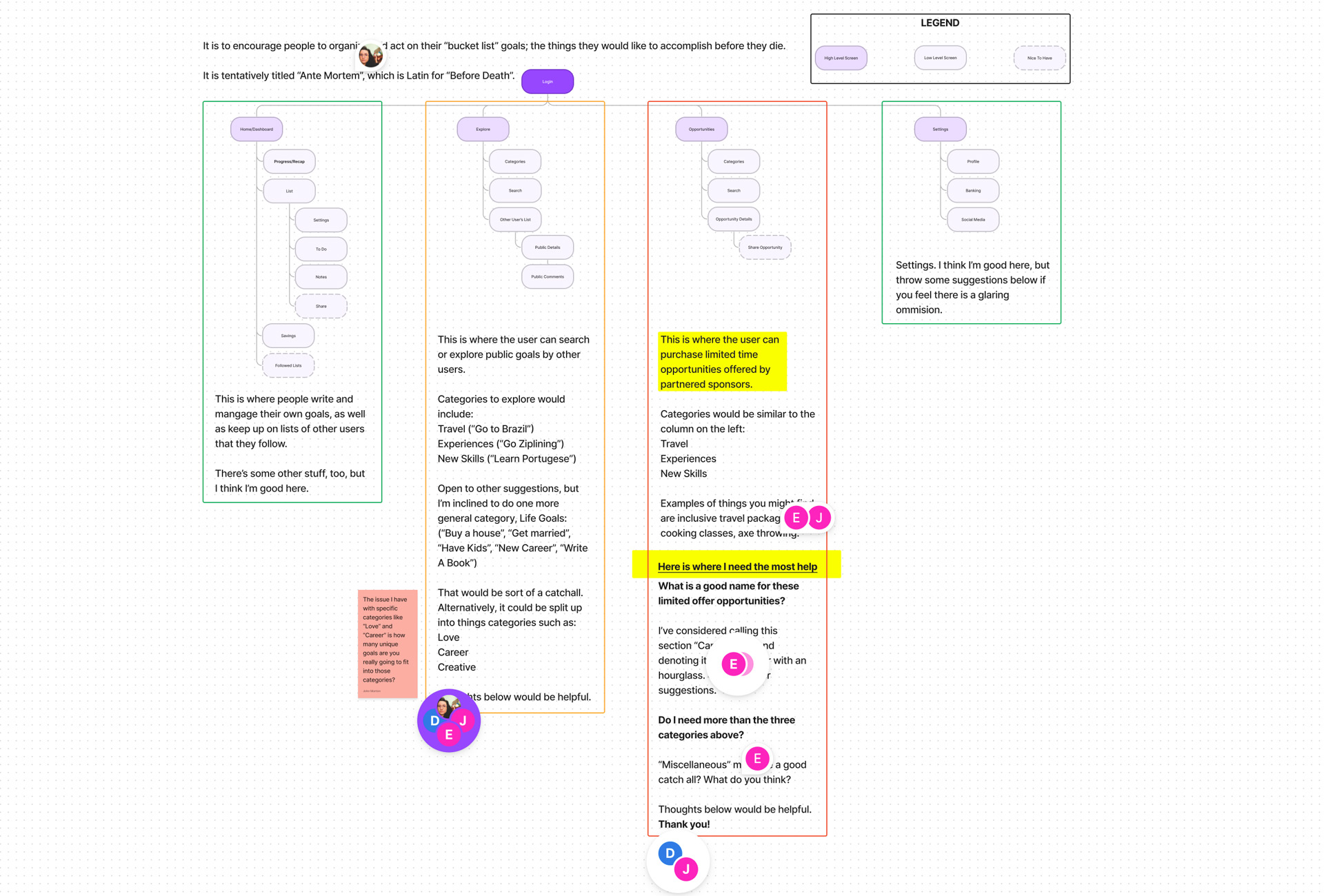
An app map was put together before wireframing in order to establish a framework for the app. The same app map was used in Figjam in order to conduct a collaborative card sort.
Wireframes
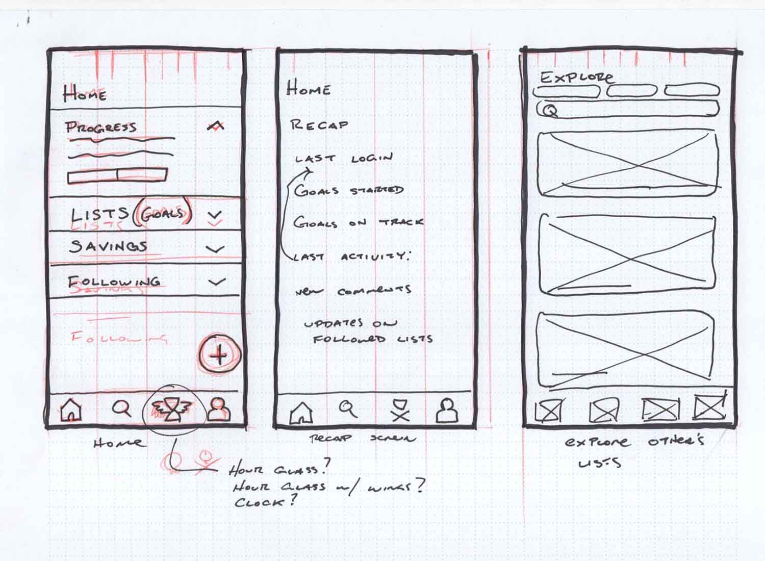
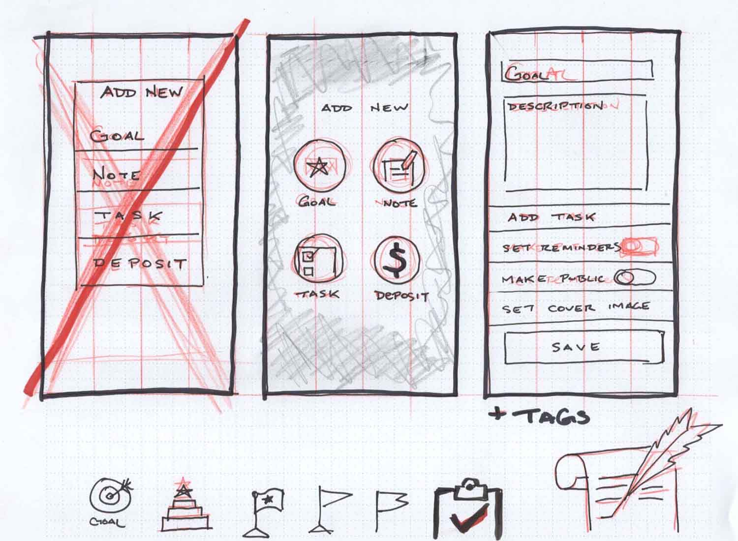
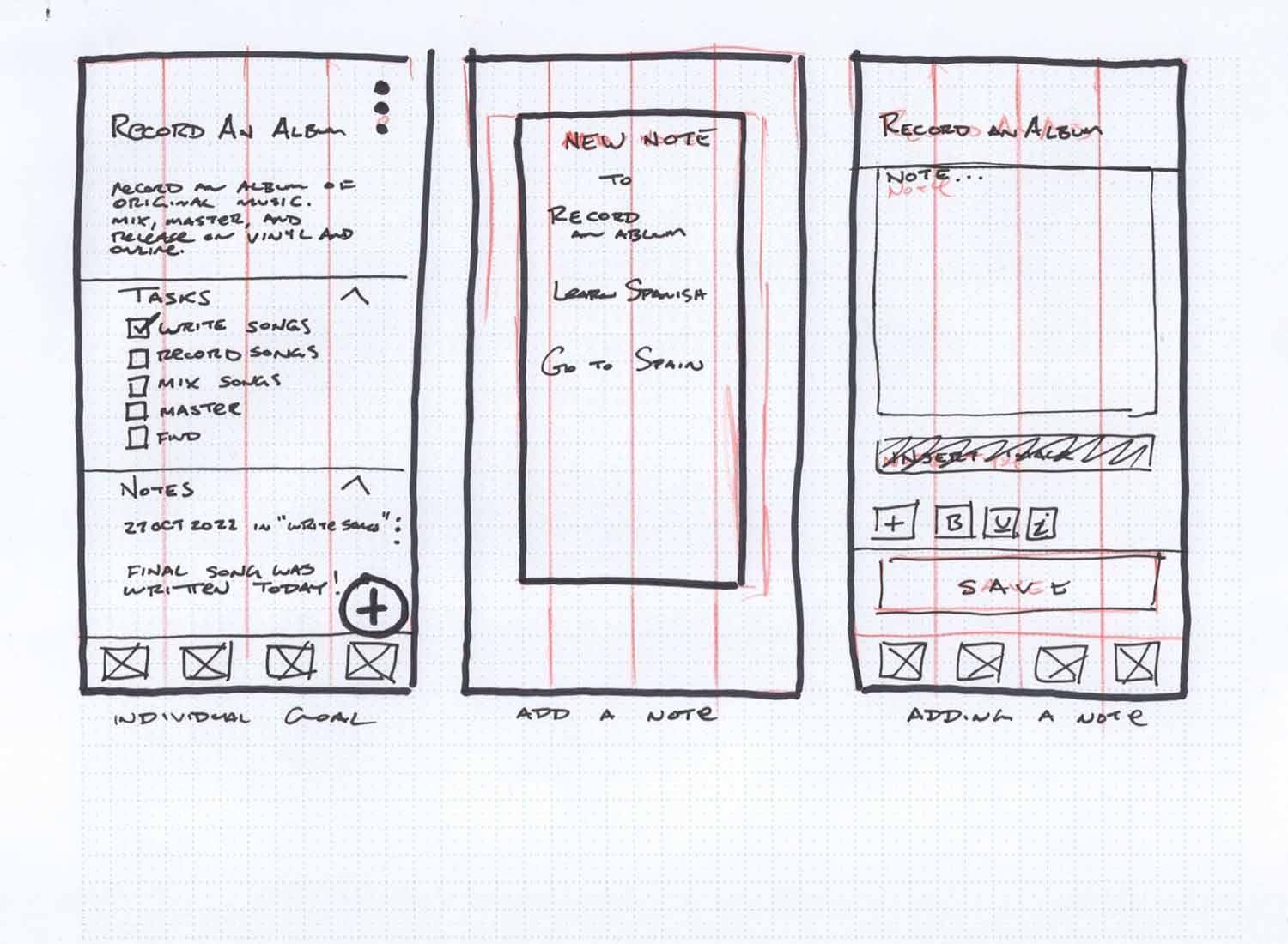
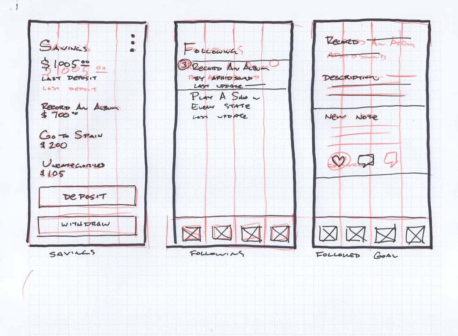
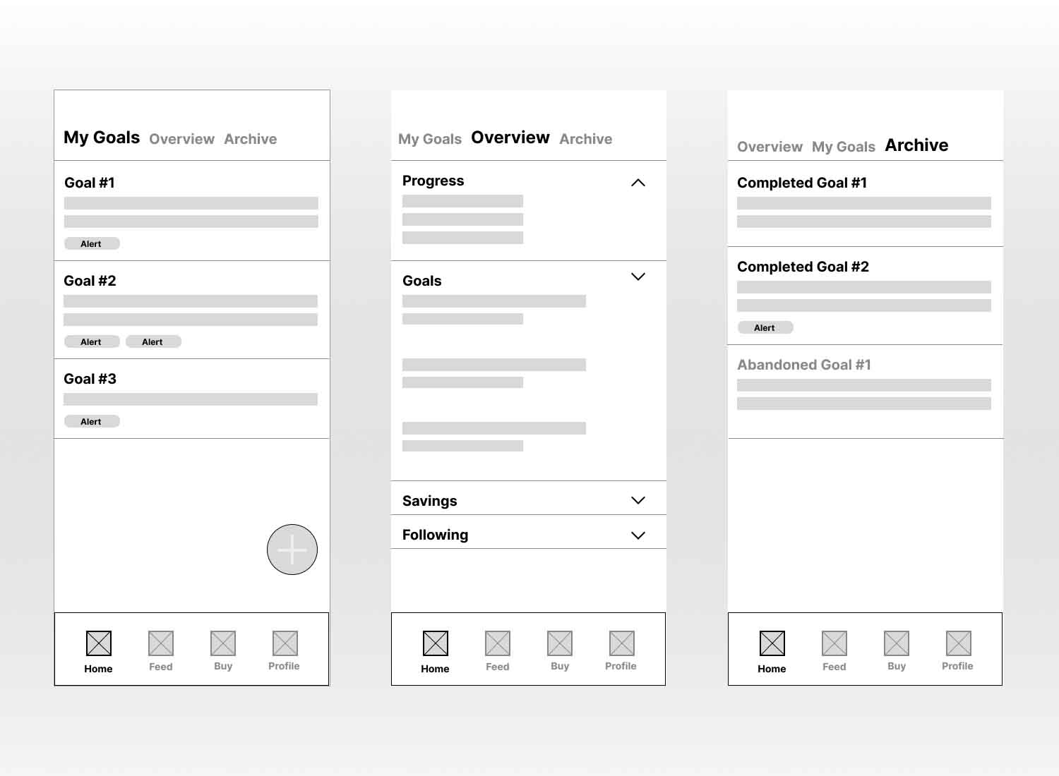
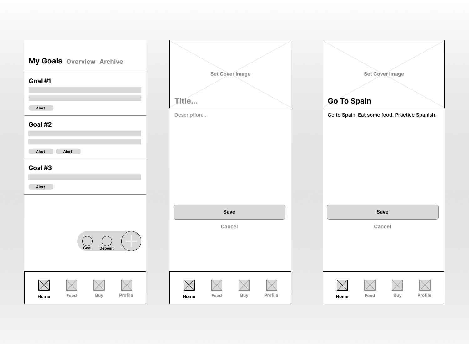
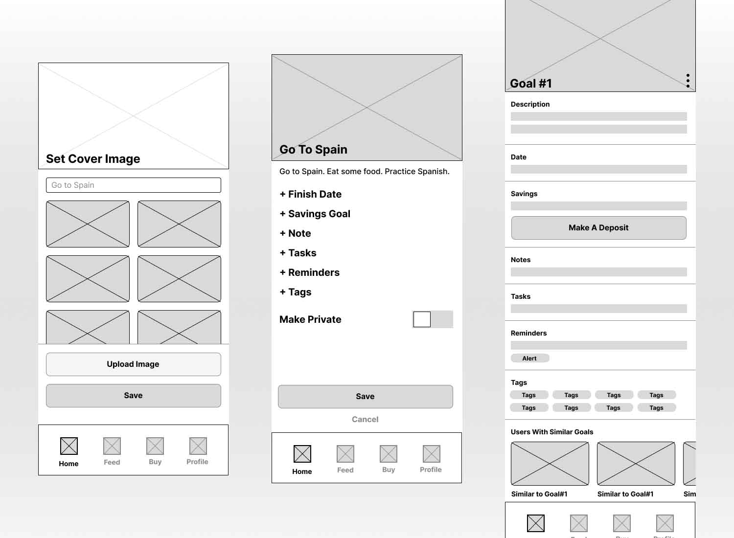
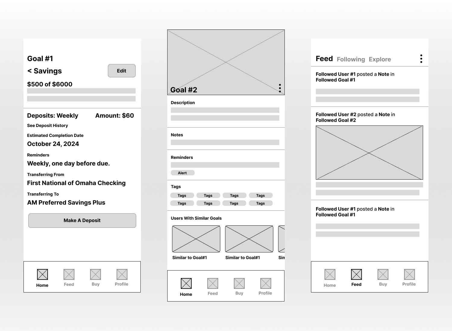
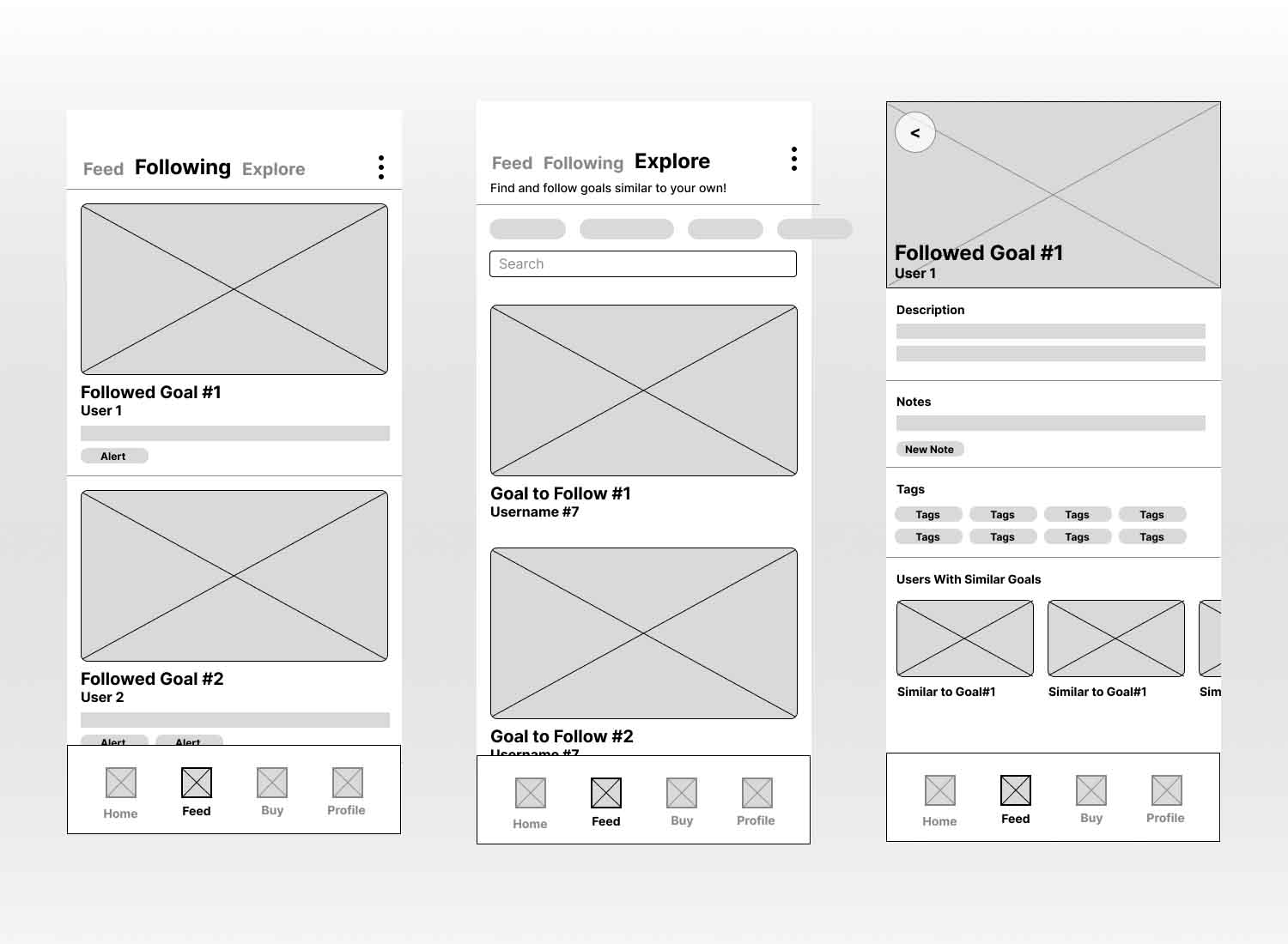
Hand drawn wireframes are a fast way to get ideas out and evaluated. Those lead to mid fidelity wireframes in Figma as a further validation before prototyping.
Interaction Design
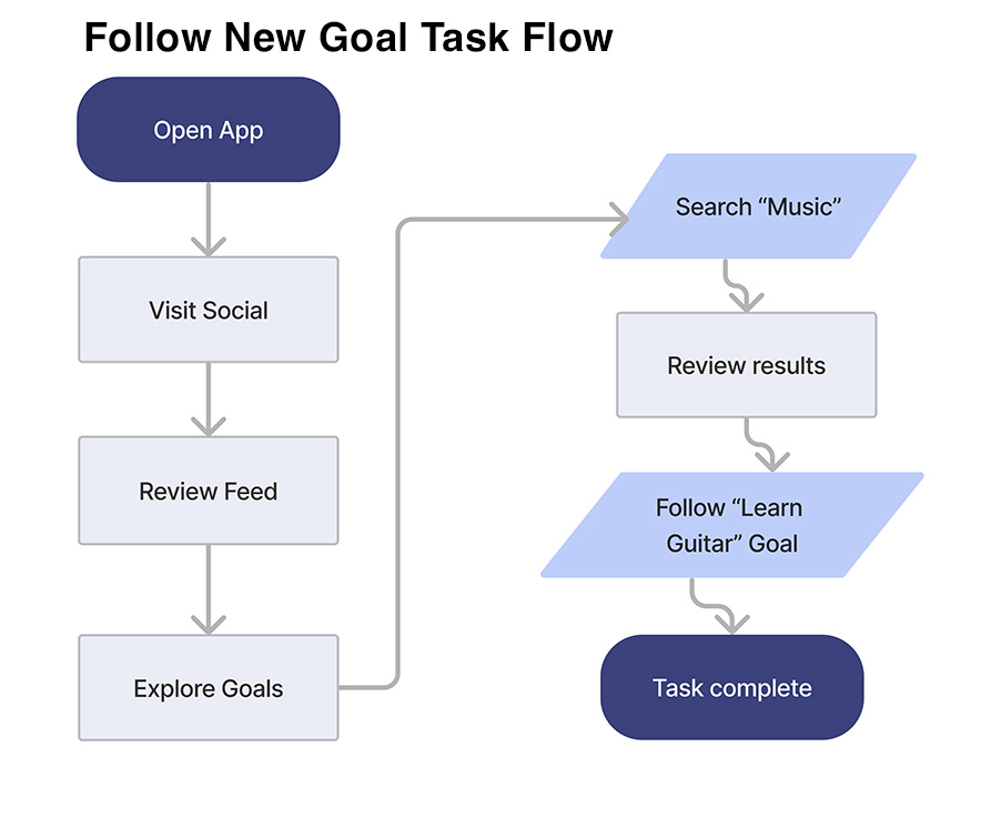
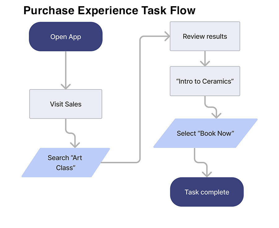
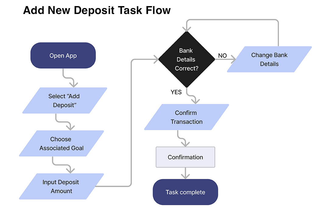
These task flows demonstrate three likely tasks in different sections of the app.
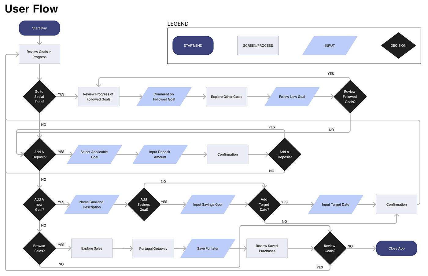
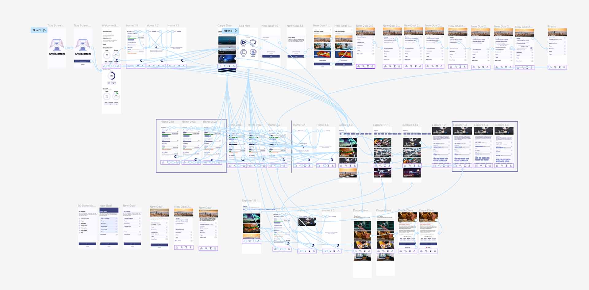
The user flow demonstrates several ways the app may be used within a single session. It incorporates the task flows above and also presents some other possible user scenarios.
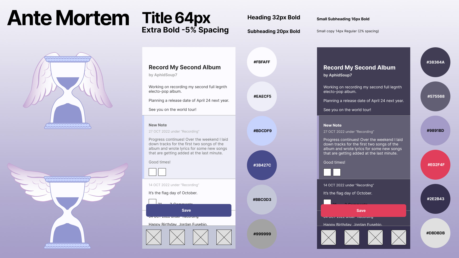
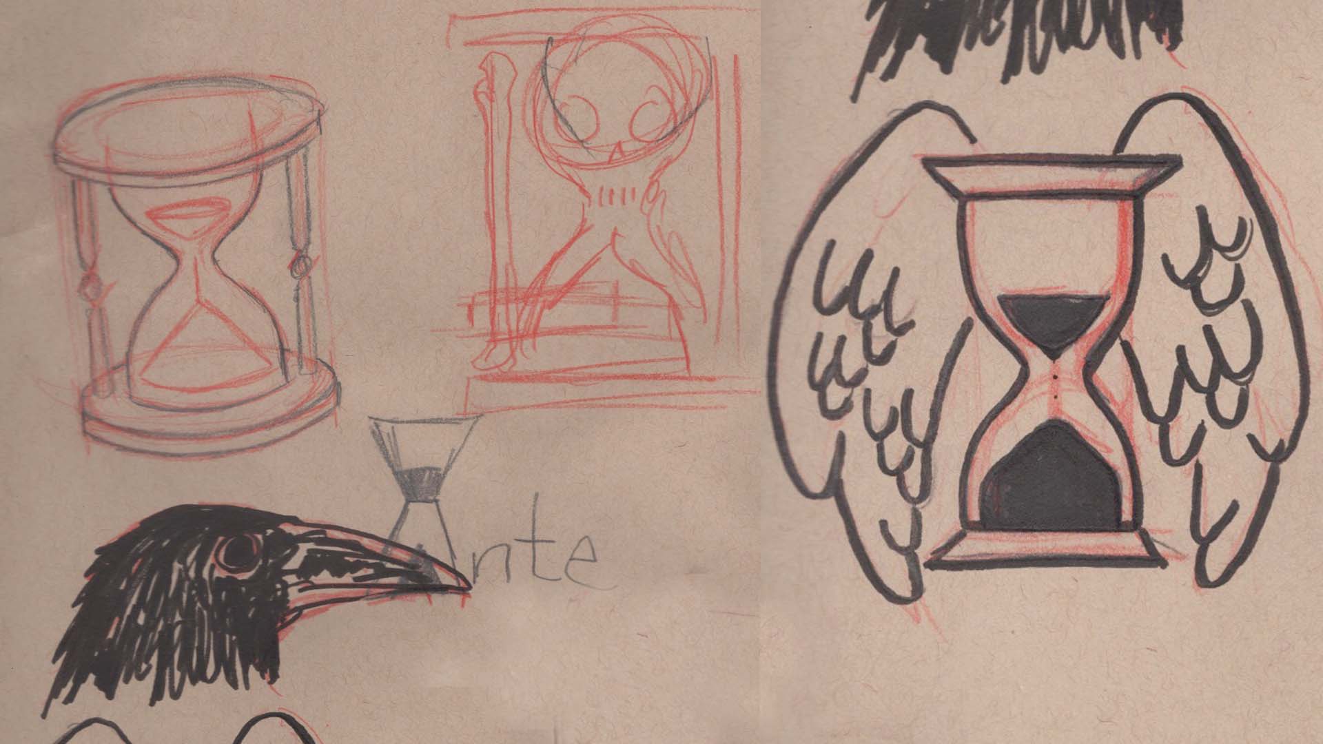
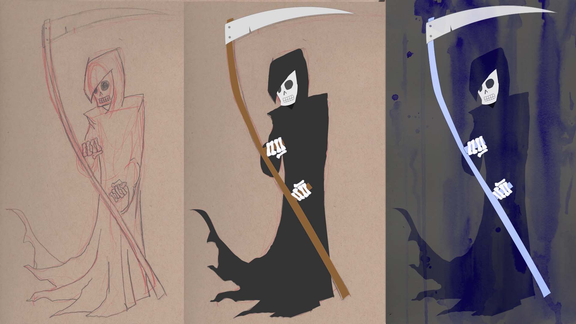
Brand Logo, Style Tile
Prototyping
An initial prototype tested four tasks:
Log into the app and create a new goal
Create a savings sub-goal
Find a similar goal by another user to follow for inspiration and insights
Find a unique experience online or locally to purchase as part of a new or existing bucket list goal
Usability Tests & Priority Revisions
Participants were 100% successful in completing the tasks in the initial prototype.
However, how they completed the tasks indicated areas for improvement.
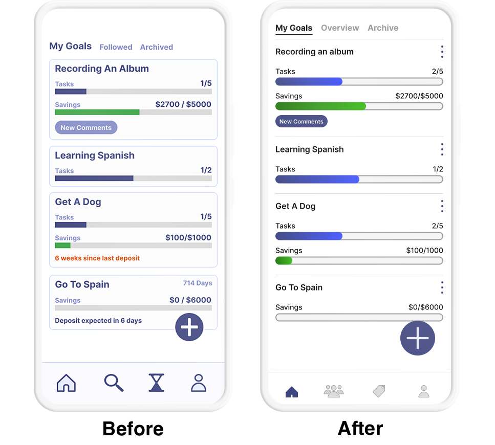
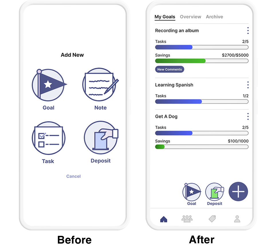
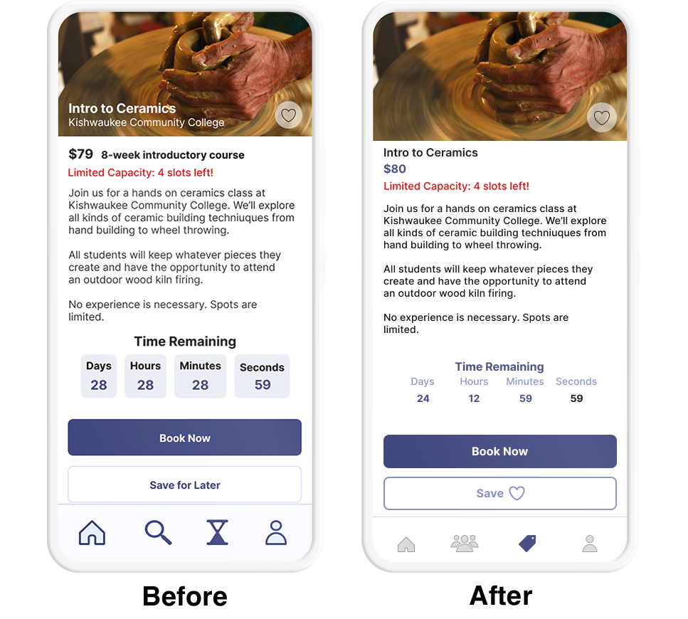
Changes to the information architecture were made by swapping out the Explore category with a Social category indicated by a new icon of a group of people. In addtion to being the spot to find users to follow, it was updated to include the social feed and list of followed users.
The timer representing limited time purchase opportunities was swapped out for a more familiar Sale Tag icon.
Aesthetic changes to the UI were made based on feedback from peers. The updated interface is cleaner and has more white space for elements to breathe.
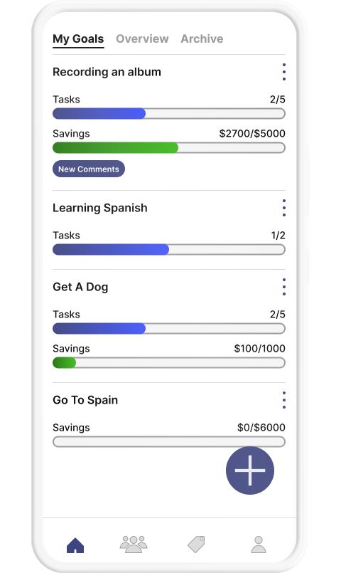
Current Iteration Summary Features
Next Steps
Iterate on icons and animations
Due to the time constraints, the focus was on the research and the functionality of the app. Less time was devoted to making slick icons and animations.
Lean into social features
The social aspects of the app were kept to a bare minimum for the MVP. Research found that goals were individualistic, but users enjoy following people with similar goals to a point. In building out the social features it is important to keep in mind that the goal is not to build another social network.
Reconsider the name
Similar to some of the icons and animations, the name was chosen quickly in order to keep the project moving forward. There were no objections or alternatives offered by users who tested the product, but it does sound very formal being Latin for "before death".
UX Case Studies
© 2023 John Everett Morton. Built with Semplice and Wordpress.
