Catchlight


Timeline
80 Hours
Tools
Adobe XD
Illustrator
Photoshop
Optima Card Sort
Miro
Role
Sole Product Developer
(Research, Information Architecture, UI, Prototype, Testing, Iterations)
Problem
Catchlight, formerly the DeKalb County Artist Collective, required an eCommerce solution to sell handmade products produced by their artist members, which would also serve as a recruiting portal for prospective members.
Tasks
Identifying the problem through research; establishing Information Architecture, developing UI Kit, persona, logo and branding; wireframes, prototyping, and conducting usability tests; iterations, additional testing, and preparing files for developer handoff.
Findings
Users want to connect to the story of the artist
Quality pictures and descriptions help the user feel more confident about a purchase.
Users often need to revisit an item once or twice before deciding to make a purchase.
80% of users are women, age 25-38
Research
Competitve Analysis

Etsy
Opened 2005
96.34 million buyers in 2021
7.5 million sellers
Annual Revenue: $2.3 billion
Sales Volume: $10.28 billion
Annual net income: $493.5 million
79% of buyers identify as women
Strengths: Market share, name recognition, advertising
Weaknesses: Separate shipping costs from each seller

Amazon Handmade
Opened 2015
300 million customers (site wide)
6.3 million sellers
Strengths: Name recognition, Sellers can ship from own location or opt for Amazon fulfilment
Weaknesses: Not the primary focus of the parent company; Not historically known for handmade items

Aftcra
Opened 2031
Estimated 0.5% marketshare
Only sells items handmade in the United States.
Strengths: Niche market
Weaknesses: Virtually unknown
User Interviews
I interviewed four potential users to determine their goals, needs, and pain points.
Goals
Most participants mentioned knowing the maker's story or supporting the livelihood of an independ artist.
Getting something unique or personalized was also a consideration.
Needs
Every participant mentioned the importance that quality pictures play in their expectations for an item.
Multiple pictures shown in the context the item is used makes them feel more confident in their purchase.
Pain Points
All noted a downfall in not being able to observe or try on an item before purchasing.
Half noted that they do not buy an item the first time they see it, and leave to consider it later.
A high price might keep one from purchasing something that wasn't a necessity, but this was less of a concern if the item was a gift for someone else.
Persona
The Shannon persona was based on a demographic discovered through secondary research and user interviews.
Identifying with the persona helps create empathy with the user.
Shannon is an amalgam of interview participants.

Information Architecture
A hierarchy of items and categories was determined through card sorting by prospective users.
The resulting information helped determine an initial site map and loose sketches for the site.


Interaction Design
Probable user task flows were designed to show how a user might navigate through sections of the website.


These task flows were integrated in various ways to show how a user's experience might look like from first landing on the site to eventually leaving the site, hopefully having made a purchase.

Design
Rebranding and Logos
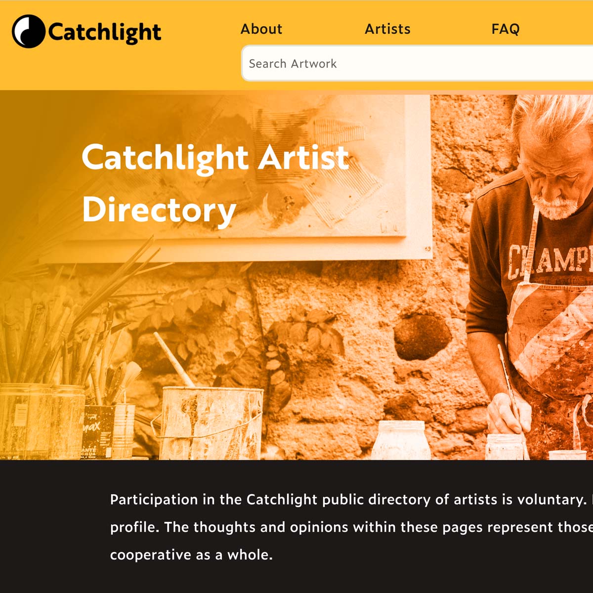
The Dekalb County Artist Collective saw the launching of their first site as an opportunity to rebrand. The name Catchlight was chosen based on feedback from prospective users from a list of proposed names offered by the members.
The logo reflects the defintion of the painting term:
Catchlight: a reflection off the eye that bestows life unto the subject, notwithstanding its small size.
The term serves as metaphor in that the collective helps bestow life unto the community (notwithstanding its small size).
Additional Insights
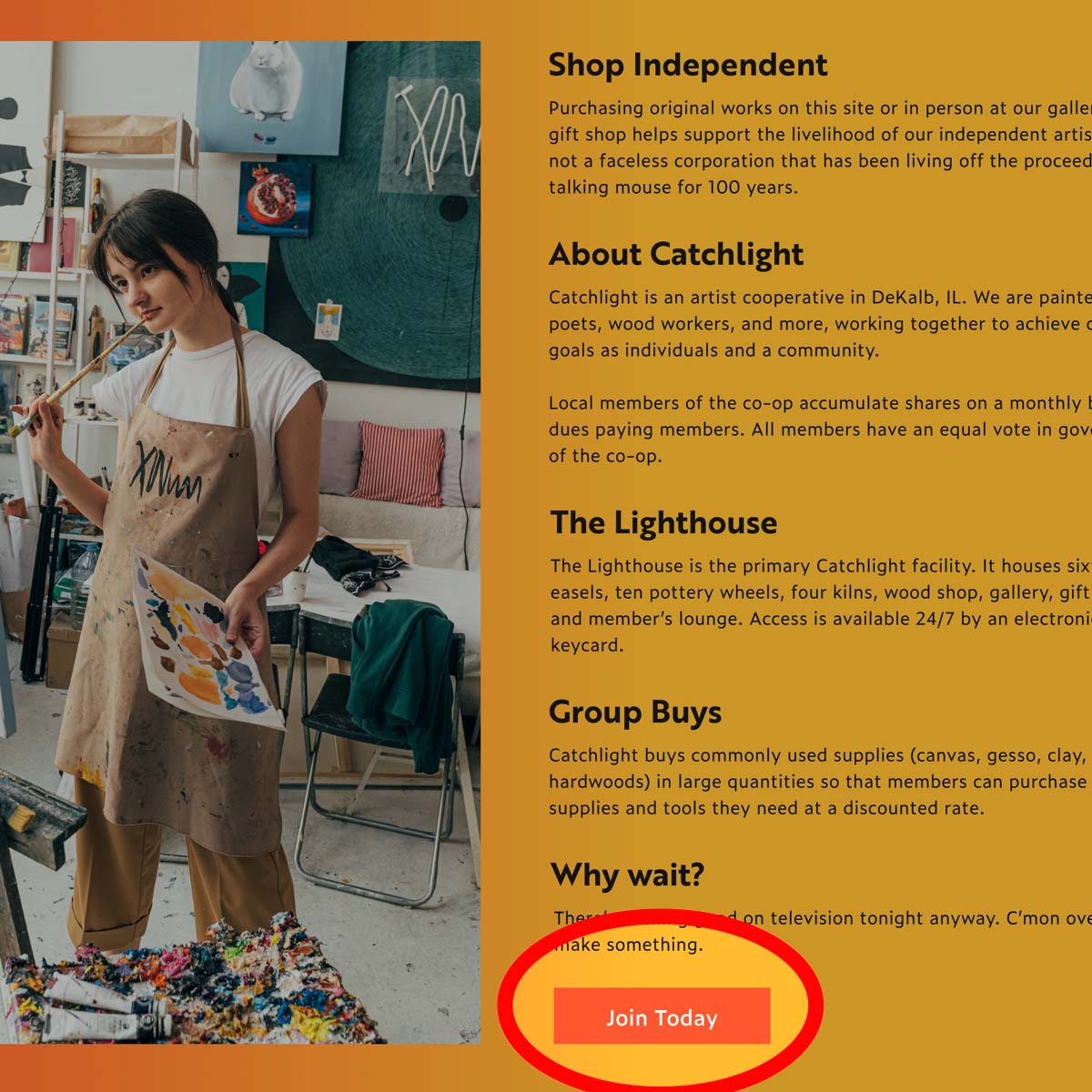
In addition to being an eCommerce site, the product needed to strike a balance between selling goods and recruiting new member artists to the cooperative.
UI Kit
A UI kit was developed to help keep designers and developers on the same page when taking the designs to development. This also helps keep future iterations consistent.
This kit shows icons used on all responsive versions of the site, and also calls out some mobile and tablet features, such as the Hamburger Menu and floating shopping cart icon.

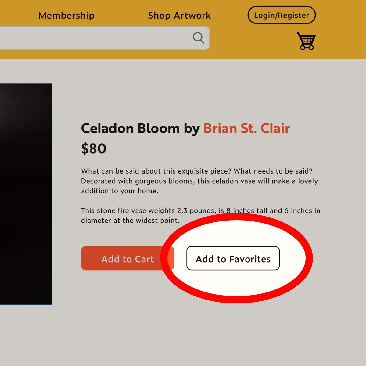
Necessary and Compelling Features
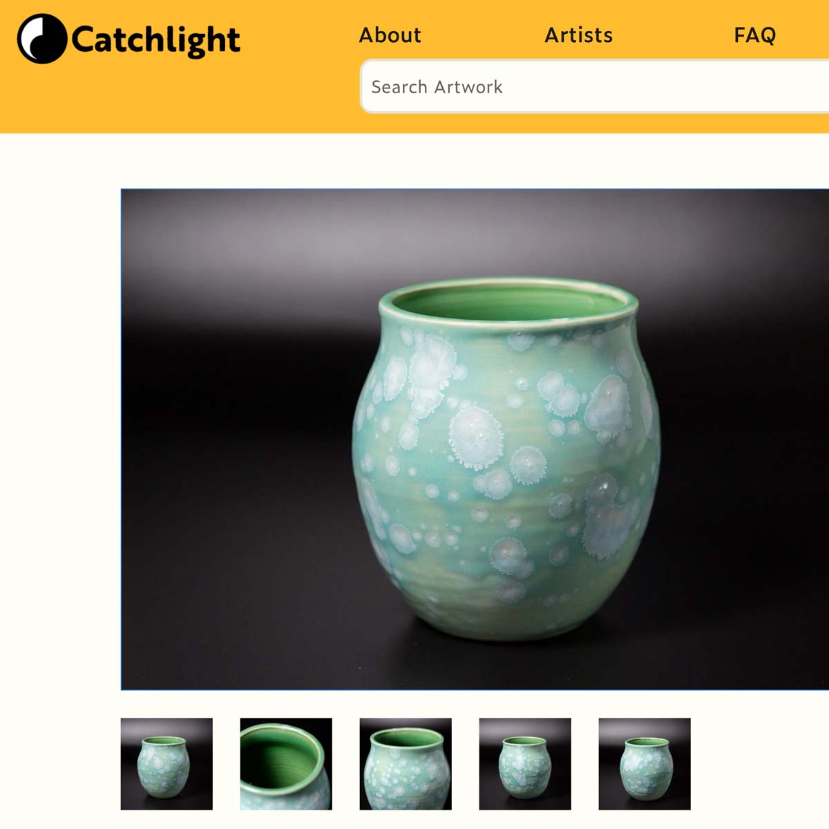
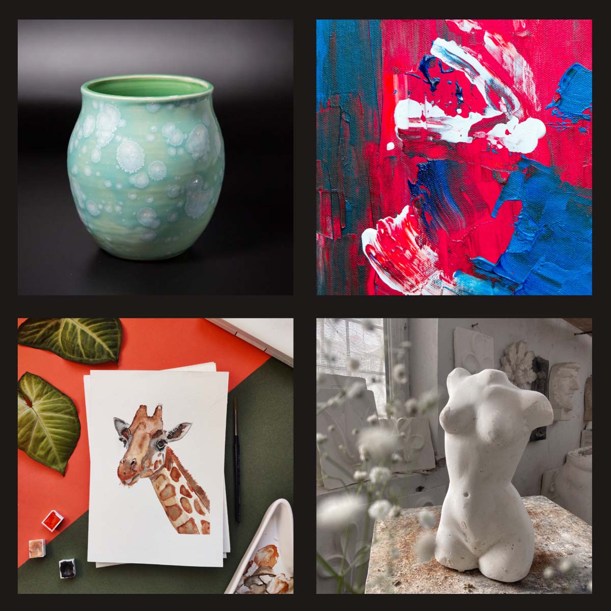
Quality Photographs: Along with a complete description, numerous high-quality photos make the user more confident about their purchase.
Save for later: Users frequently felt the need to view something more than once before making a purchase.
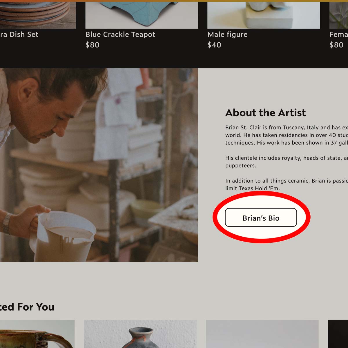
Artist Profile Page: Each item links back to the artist who made it and the artists are listed in the member directory.
Call to Action: Multiple placements to inform local artists of membership benefits and offer the opportunity to join.
Artist Directory: Discover artists, their story, and their preferred medium through the directory links that lists all participating members
Prototype
Prototypes for the Catchlight site were composed in Adobe XD. The progression went from first visual mockup, fully functioning prototype, priority revisions (following testing), and final functioning prototype.

eCommerce Flow
These thumbnails represent the flow of the online shopping cart checkout experience.


Testing
The Adobe XD Prototype was linked with Maze to test five separate blocks of varying difficulty. The overall score figured by Maz was 93%. The greatest source of improvement was for finding an artist's profile. A single user briefly went off the path before completing the task successfully.
1. Learn more about Catchlight
Average Success: 100%
Average Duration: 12.5 Seconds
Average Time/Screen: 6.3 seconds
2. Find Briand St. Clair's Profile
Average Success: 83.3%
Average Duration: 10.4 Seconds
Average Time/Screen: 3.5 seconds
3. Add "Celadon Bloom" to cart
Average Success: 100%
Average Duration: 34.2 seconds
Average Time/Screen: 3.9 seconds
4. "How easy did you feel these missions were to complete?"
Average Response: 9.7/10
(No responses below 9)
5. "Would you like to share any thoughts or demographic information that might help with this project?"
No mentions of navigation. One off suggestions included: Listing artists' medium next to their name, reconsidering yellow for the brand color.
Iterations
Added Hero Image: This striking image also includes a brief description of the site.
Expanded Featured Items: Going from one row to two rows of features items doubles the number of pieces that can be featured immediately.
Below the Featured Items a word cloud of Suggested Categories offers an alternative method to browse.
Larger Images: The larger images are more striking and offer the opportunity to use more copy.
Regorganization and use of color: The call to action to become a member of the Catchlight cooperative has been moved up higher on the page. Use of the brand color as a background also helps it to stand out more.
Revised

Initial

Conclusion and Next Steps
User research showed that users will pay a premium for an original piece from a human being, versus a mass-produced product from a faceless entity
The description of items must be clear with numerous quality photographs to instill consumer confidence.
Catchlight required not just an eCommerce platform, but a recruiting tool for member artists.
Usability tests proved the site is easy to navigate and takes advantage of established design conventions.
The combination of research and tests brought about the development of a balanced and successful product.
A future version might consider a member portal where members can update their profile, listings, and pay their dues.
UX Case Studies
© 2023 John Everett Morton. Built with Semplice and Wordpress.