Catlin Park of LaSalle County
Please Note: This is a current work in progress. This is not a complete case study.
Timeline
February 2023 - Present
Tools
Google Satellite Maps
Strava
Illustrator
Photoshop
Role
Artist & Designer
Deliverables
Logos: Updated old raster images to vector files.
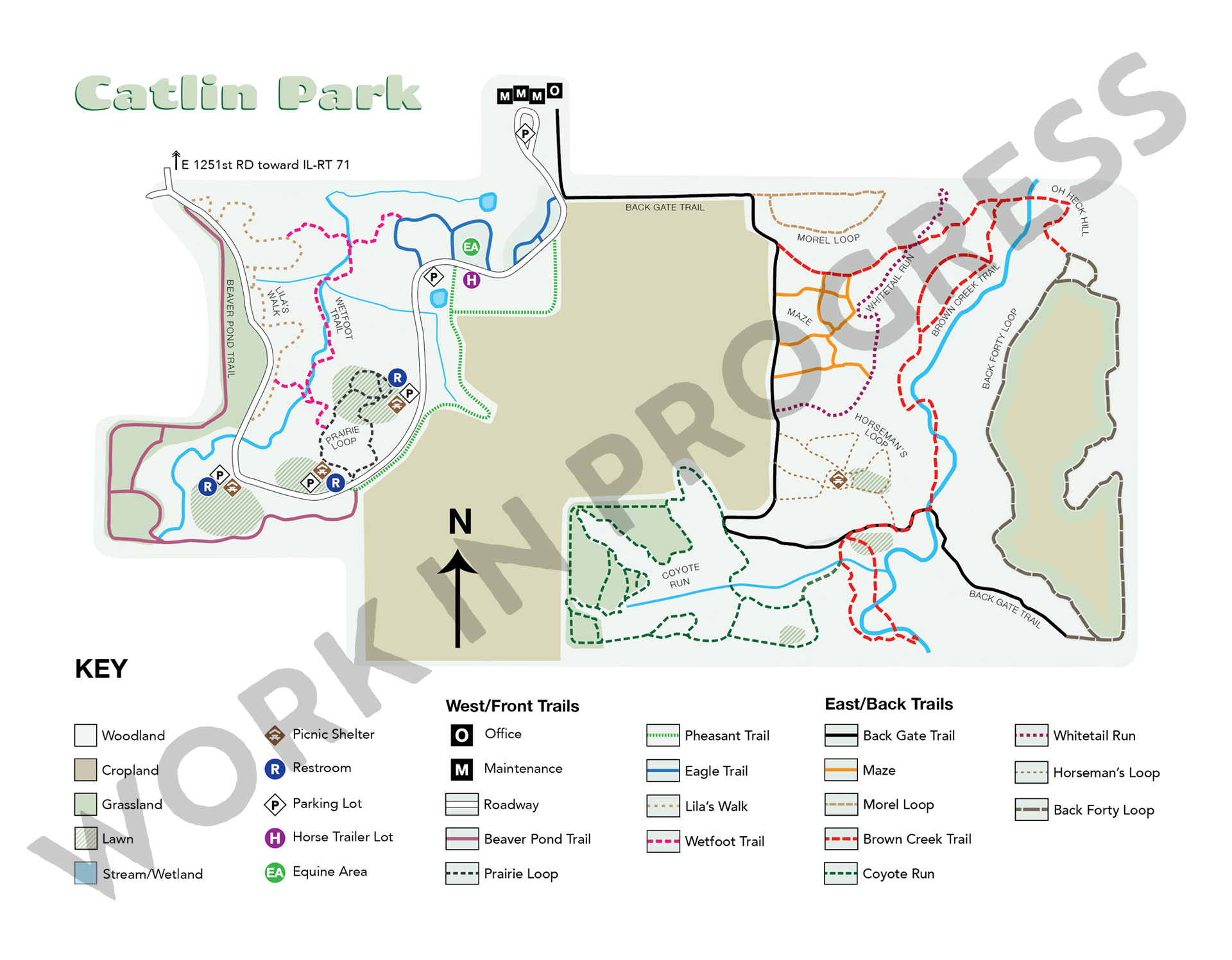
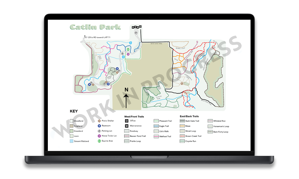
Maps: Creating new maps with accessibility features for vistors, park staff, and emergency responders
Signs: Updating old signage (TBD)
Logo
LaSalle County Parks already had a logo they were happy with, but it only existed as a patch on their uniforms.
Using a scan of the uniform patch, I traced the objects in Illustrator to provide a vector graphic, which could be used to order magnetic signs for the park trucks.
Completing the logo according to their needs led to developing a new map for the park trails.
Park Map
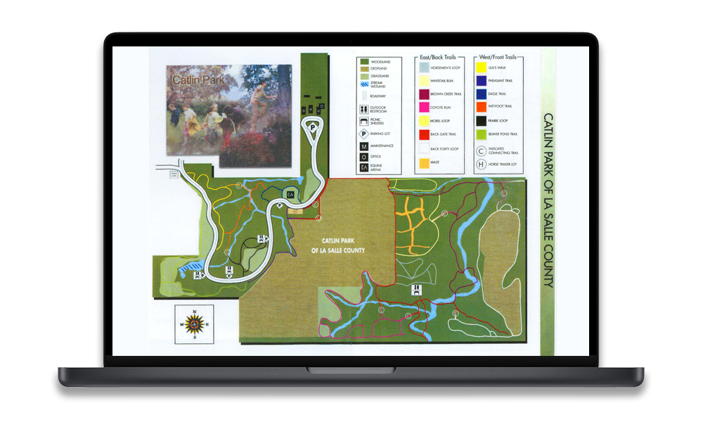
The original park map was decades old. It was not to scale and several trails were incorrect having changed over time.
Perhaps the greatest failing of the original map was that it did not take any accessibility into account. Even users with high color perception had difficulty differentiating between trails with similar colors.
Original Map
Process
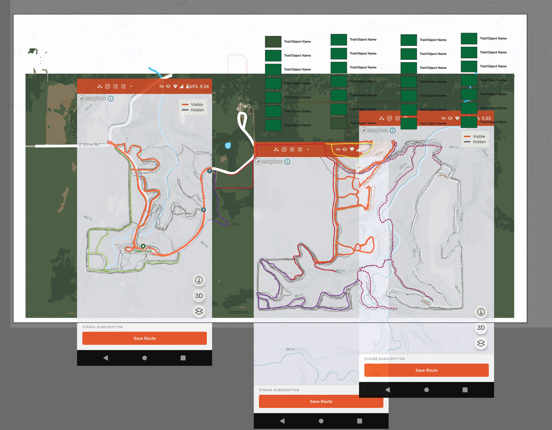
Using the Strava app to obtain data from unmapped and previously mapped trails, the screen shots were scaled and laid over a satellite image obtained from Google Maps.
The satellite image was simplified to remove unnecessary detail.
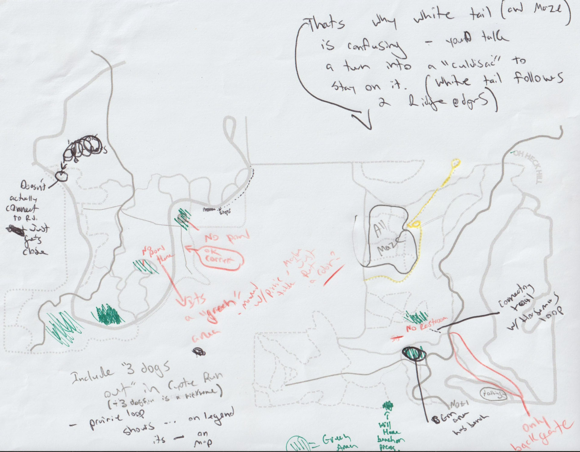
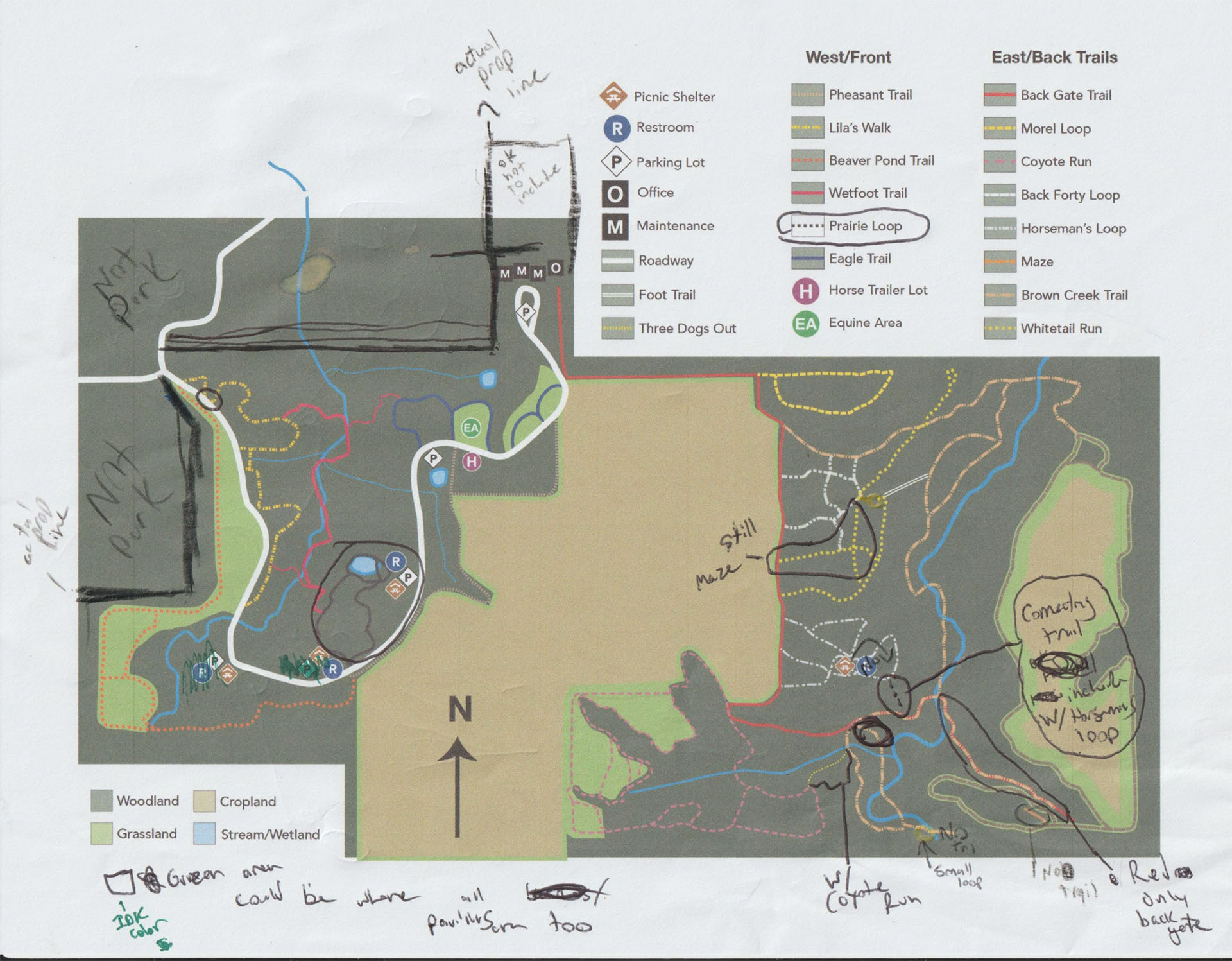
Different version of the map were delivered to get feedback and notes from the park director.
This version omitted all background colors and turned the trails to grey in order to make hand written notes and adjustments more visible.
This color version was supplied in order to get some feedback on the park boundaries and differences in trails.
Current Iteration
Updates
Background Colors: For viewability the background colors have been further muted, and may be adjusted further.
Corrected Trails: Trails have been corrected per the park director
Copy: Temporary copy has been added to the map. This will be refined later.
Next Steps
Accessibility Check
This is paramount for this project. Improvements have been made over the original, but the final colors will be double-checked before calling this project done. The final colors will likely use some combination of Paul Tol's Colorblind Safe Palletes in addition to distinct dashed lines.
Visual Refinement
Once all the trails are correct, the UI will be refined to be more pleasant. This will include placement and final determination of the copy, updates to the compass rose, and final legend items.
Multiple Sizes
At the start of the project the intent was to create a single large map, measuring 4 x 8 feet. Along the way I was asked to switch gears and prioritize a small, letter-sized map. This will serve as a portable map for visitors and first-responders.
Once this version is approved, two larger versions will be created. This will require scaling the text appropriately so that it is viewable at the intended distances.
View more UX Case Studies
