Discogs
Click and drag to use the interactive slider to see the differences between the Before and After or click to enlarge the thumbnails at the right.
Introduction
Discogs is an online database and marketplace for music collectors. It started as a database for electronic music and today it facilitates the sales of physical music. Vinyl records make up 75% of those sales. This case study represents a conceputual product design.
Timeline
80 Hours
Tools
Adobe XD
Illustrator
Photoshop
Miro
Role
Sole Product Designer and Researcher
Tasks
Identify the problems with the exisiting platform
Clean up the UI within the framework of the current platform
Implement a feature to allow users to save preferred filters
Clarify wording around wantlist items within the seller's inventory
Build, test, and iterate interactive prototypes.
The Problem
Inquiries into to the Discogs community revealed two common pain points:
- The inability to set a default country to shop from
- The inability to save any kind of search filters
Searching the archives of the Discog message board helped confirm this and suggested other problems.
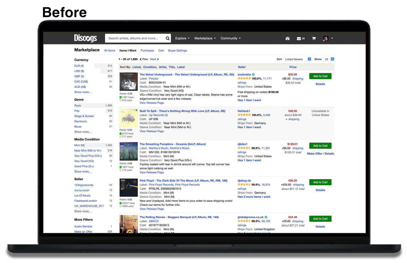
Usability Testing [Existing Product]
A usability test was conducted with six participants, a blend of casual Discogs users and others who were not familiar with the specific platform, but had other ecommerce experience.
Users were asked to log in to an existing account for the purposes of testing the “Items I Want” page in the Discogs Marketplace. The results confirmed the need to set and save filters, especially the ability to set some default settings (eg. Show only items shipping from the United States).
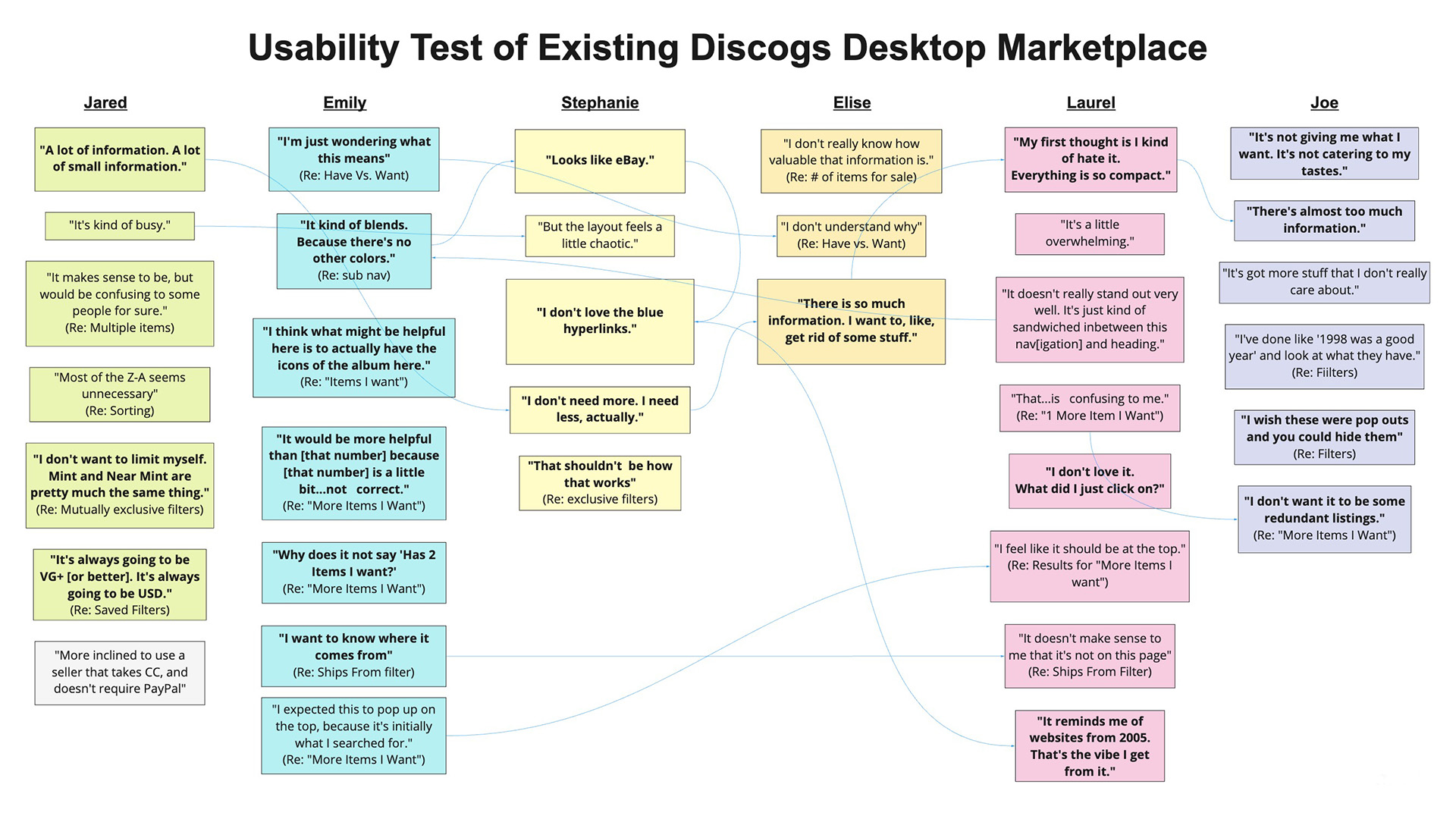
Notable User Statements
"I don't want it to be some redundant listings."
-Joe on original "More Items I Want" feature
"My first thought is I kind of hate it. Everything is so compact."
"It reminds me of websites from 2005. That's the vibe I get from it."
-Laurel on look and feel
"A lot of information. A lot of small information."
-Jared, on look and feel
"There is so much information. I want to, like, get rid of some stuff."
-Elise, on look and feel
"It would be more helpful than [that number], because [that number] is a little bit...not correct"
-Emily on original "More Items I Want" feature
"I don't love the blue hyperlinks."
-Stephanie on look and feel
"It's always going to be VG+. It's always going to be USD."
-Jared on "Saved Filters" preferences
Problems Identified Through Usability Testing
Results confirmed the initial hypothesis and brought other issues into the the light.
• The UI was outdated and cluttered
• The existing filters were not effective
• No ability to save filters
• The “Has Items I Want” feature was confusing in the wording and execution
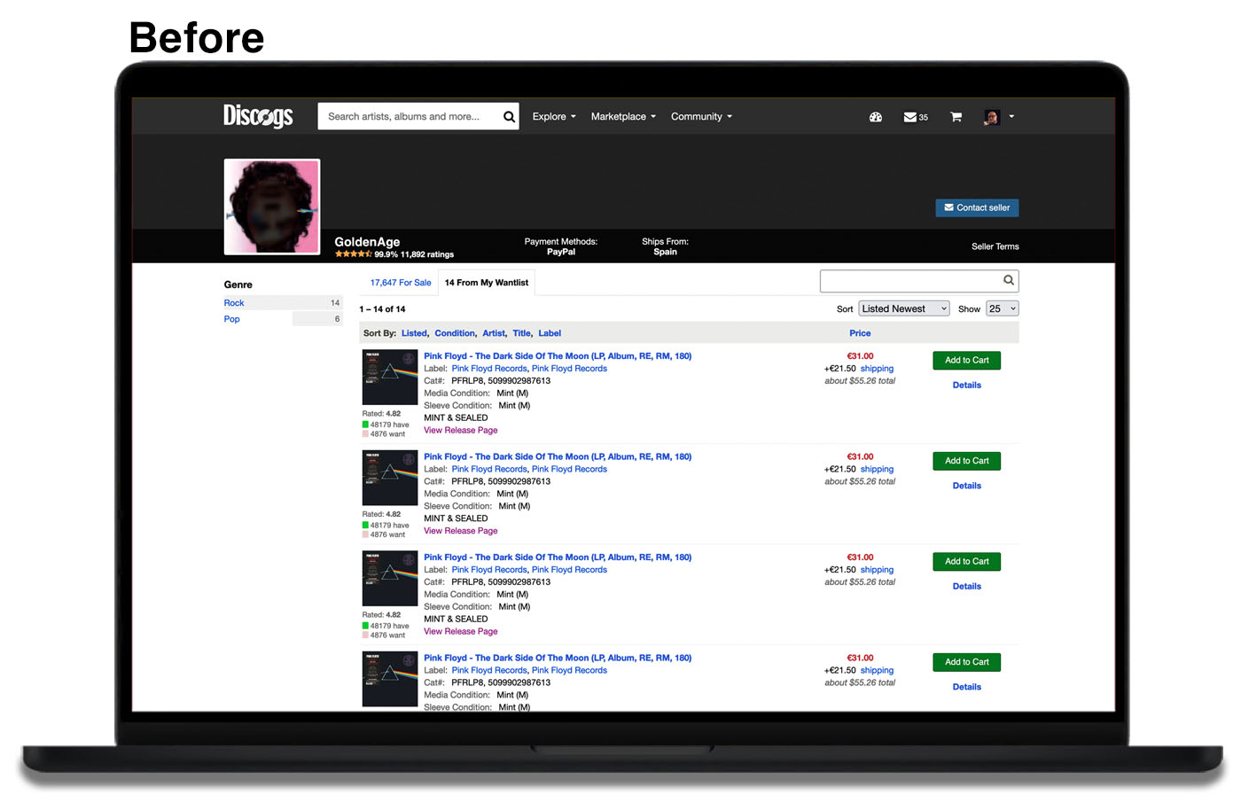
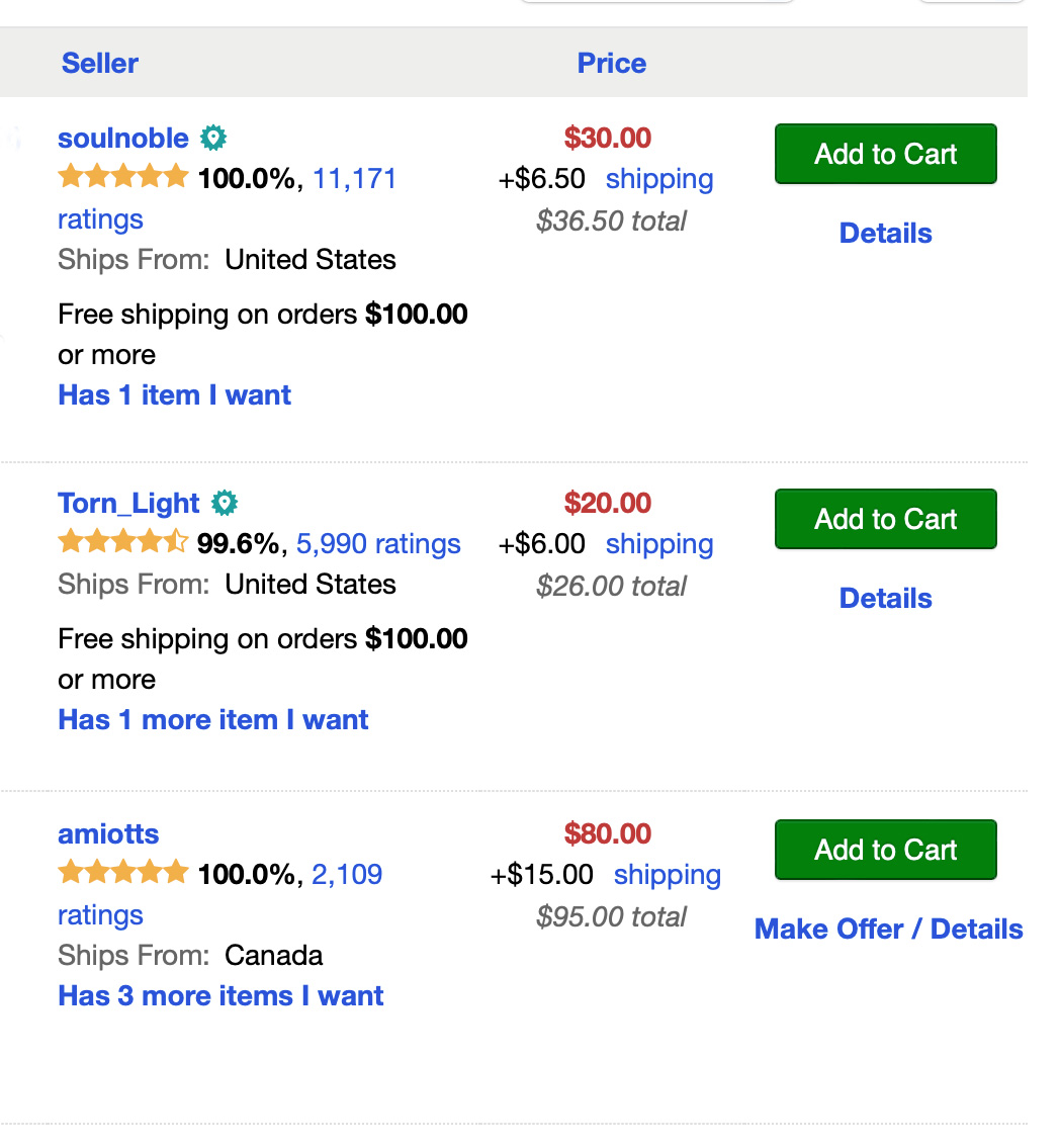
Confusion around "Has X More Items I want"
This was found to be the most confusing and inconsistent. If it reads "Has 10 More Items I Want" it might mean that the seller has ten unique items on the user's wantlist.
However, if the user has The Beatles' album Abbey Road on their want list, it might mean that the seller has 10 copies of Abbey Road for sale.
Since the user likely only wants a single copy of the item on their wantlist, this use can be very misleading.
The feature is implemented this way because each listing of the same release could be unique. There may be copies in various conditions (eg. Mint, Near Mint, Very Good) or defining attributes, such as being signed by the artist.
Competitive Analysis
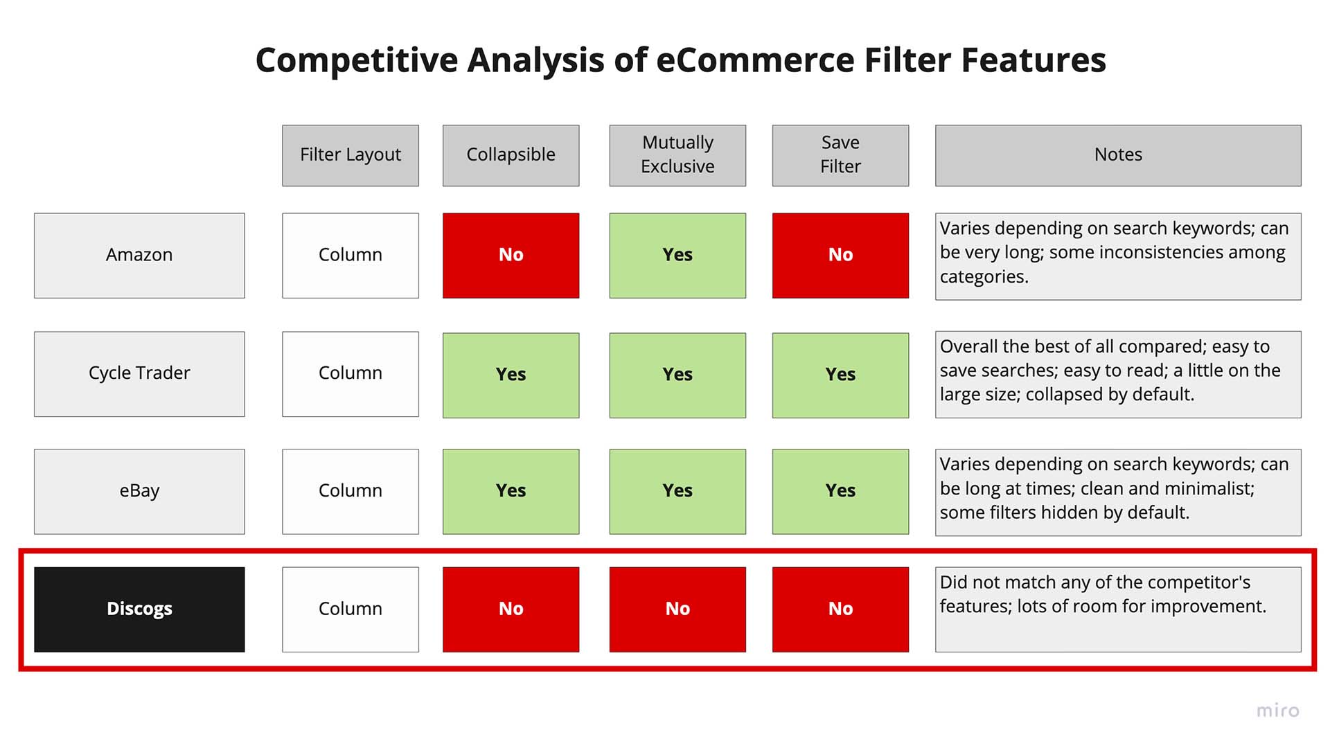
Filter styles from three other eCommerce styles were compared: Amazon, CycleTrader, and eBay
All made use of a fixed column filter model, with the last two also having a C2C business model like Discogs.
Both CycleTrader and eBay had the most desirable traits with eBay's ability to save a search being somewhat limited, and CycleTrader's filter layout being too large.
Discogs feature set for filters did not match any of the competing designs that were evaluated.
Narrow Scope to Minimum Viable Product
Due to constraints of the project, the scope was narrowed to the following features:
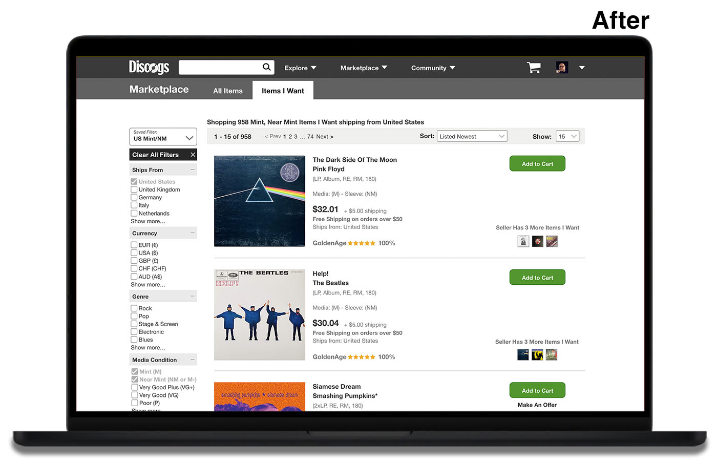
Create a “Save Filter” feature
Allow a user to establish default settings for subsequent visits. The current default is to show most recently listed items on the user’s wantlist from around the world.
Clean up and update the current UI
The existing UI was cluttered with information that is pertinent only to the most die-hard collectors (eg. catalog number of a release and record label), which is already available for inspection within their wantlist.
Users across the board were overwhelmed with the amount of information shown.
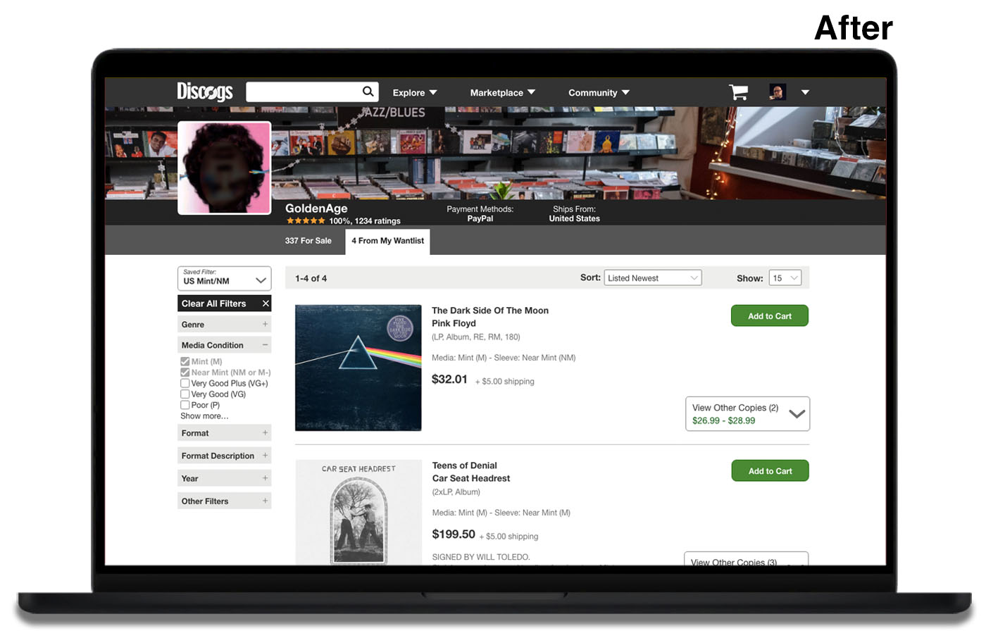
Modify the existing “Has More Items Feature”
There was a lot of confusion over what the numbers indicated.
Initial Sketches
I drew up a total of five primary versions of an updated interface. Some of the things I experimented with were size of the album art and placement of various elements. To maintain a narrow scope, all the designs used the same 12-column format as the original version.
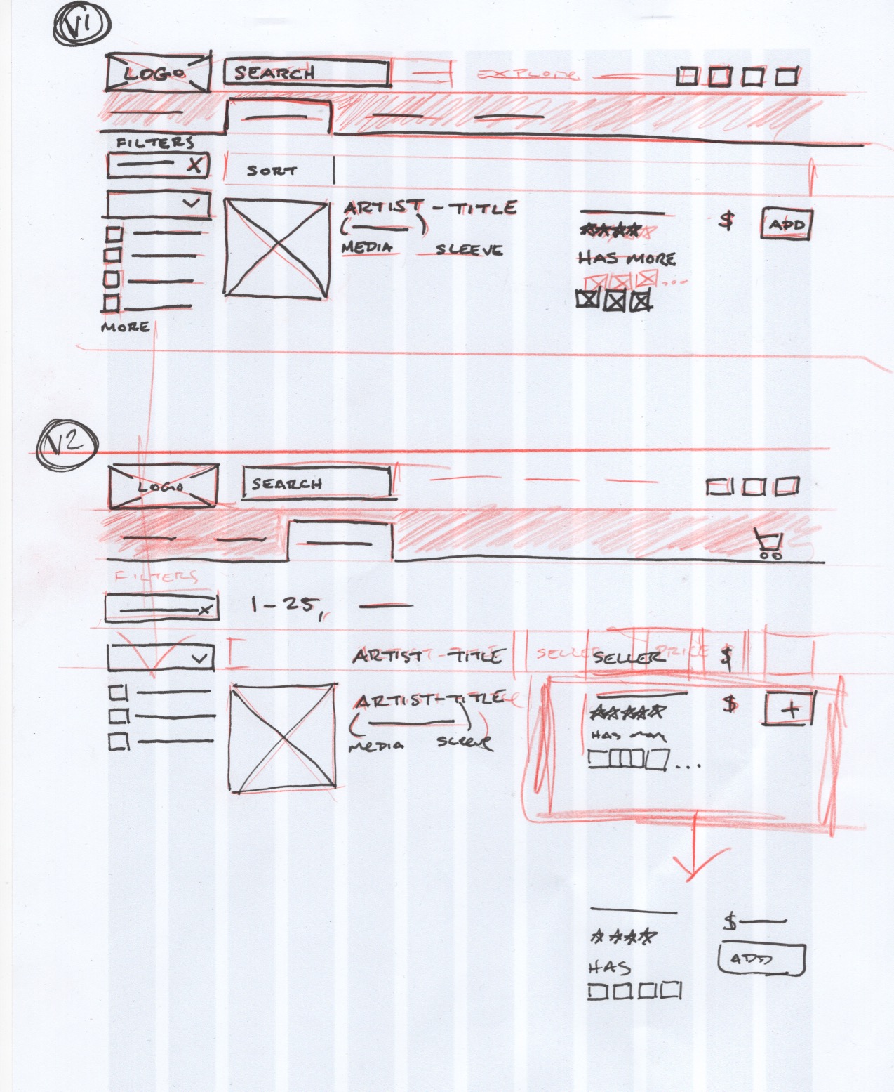
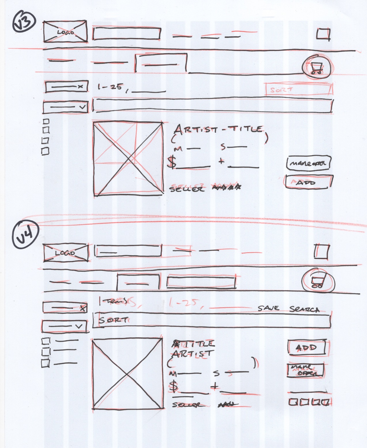
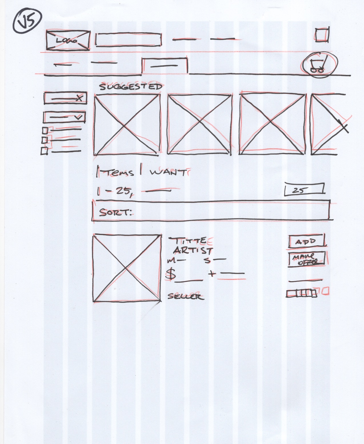
Wireframes
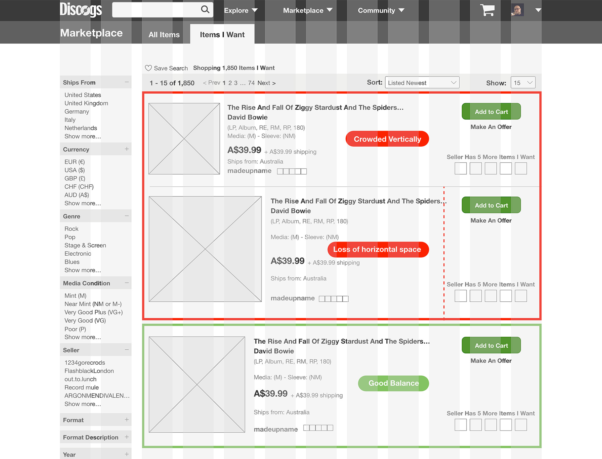
Having established that the original structure would remain intact, the primary element tested in mid-level wireframes was the individual listing.
In each of the examples below, the album size is larger than the original version. Increasing the size of the album image lends to more space vertically, but less space horizontally. Different versions were shared with some peers and the third version became what was used for the final layout before moving to the prototype.
I opted to remove the record label, catalog numbers, and seller's description.
This lead to a much cleaner and easier to read listing.
Prototyping
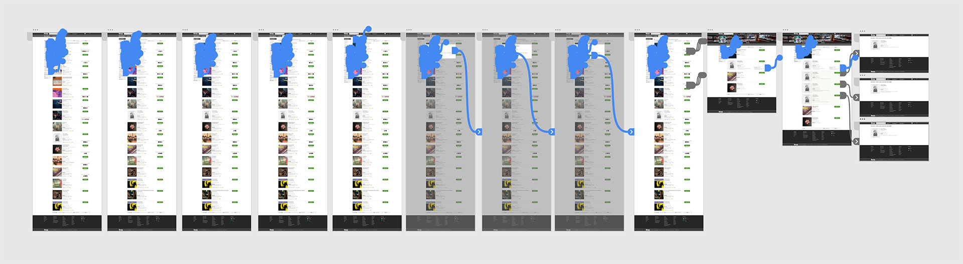
An interactive prototype was developed in Adobe XD that tasked users with the following:
- Apply three filters
- Save, Name, and set the filter settings as the default
- Explore the additional mini-thumbnails incorporated
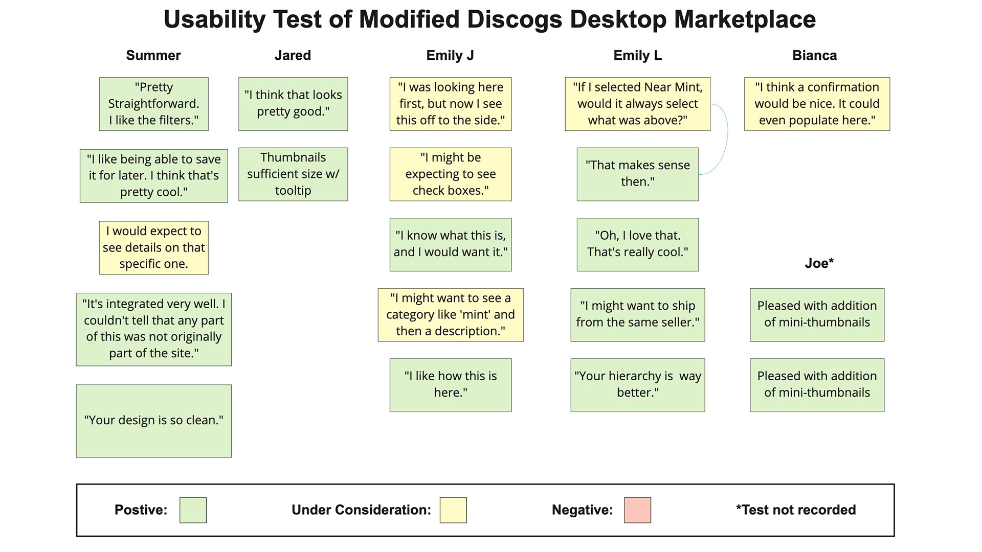
Usability Testing [Prototype]
Six participants were recruited for testing the prototype and carrying out the tasks above. Two of those participants were from the first round of testing the existing product as well as casual users of the site.
Testing had a 100% success rate. All testers made it through in short order and zero red flags.
Testing results were color coded, with successes in green and items to consider for iterations in yellow.
Those Under Consideration items were plotted in a quick Priority Matrix measuring the user benefit against the perceived difficulty of implementing those changes either in the prototype or down the road for development.
Iterations & Final Features
- The "Save Search" button was added. This was the primary added feature.
- A confirmation screen was added to the Save Filter feature during the first round of iterations.
- The Saved Filter button because expandable during iterations.
- Mini-thumbnails were added to the "Has Items I Want" feature. This was the secondary added feature.
- Multiple copies of an item from the same seller are initially hidden and removed from the total items count.
- The UI was cleaned up while maintaing the original framework.
- Album images are larger and the most important information is easier to find.
Next Steps
- Test the present design with long-time users. Can we strike a balance between what is familiar with them versus what testing shows works for a wide range of users? (In Progress: Currently being well received)
- Work with developers to modify the search feature and consistently show the most relevant results during a boolean search.
- Bring UI changes to the entire Marketplace and all auxiliary pages.
- Carry out changes to the mobile version and app
- Investigate the possibility of having the filters in a different format. The current changes were made specifically to fit within the existing framework. How might it function if the the filters were not always taking up screen real estate either with a pop-out modal or being pinned horizontally at the top?
© 2023 John Everett Morton. Built with Semplice and Wordpress.